Creativology
Rebranding · Digital Agency
A rebrand for a decade of innovation: ten years of creativity, design and technology distilled into a logotype that carries the number 10 and the code of the work inside its own letters.
- Client
- Creativology
- Location
- Amman, Jordan
- Year
- 2024
- Project Type
- Rebranding & Visual Identity
- Sector
- Digital Agency · Technology
- Scope
- Research, Strategy, Logo, Identity system
Overview
A decade of crafting digital excellence
Founded in 2014 as a web development and graphic design company, Creativology has grown into a full-service digital agency: web, mobile and desktop applications, UI/UX, branding, print and media consulting.
Ten years on, the numbers tell the story: more than 174 projects, 112 clients and work delivered across 23 countries, from Jordan and the Gulf to the UK, the US, Germany and Australia. The anniversary called for a brand that could carry that decade forward.
The Concept
Ten, hidden in plain sight
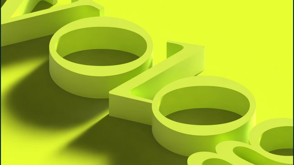
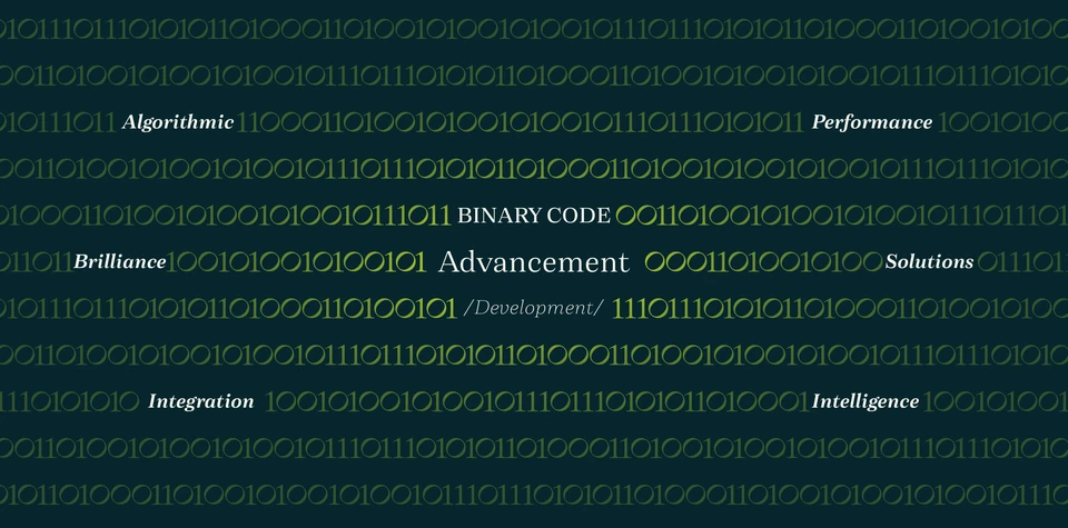
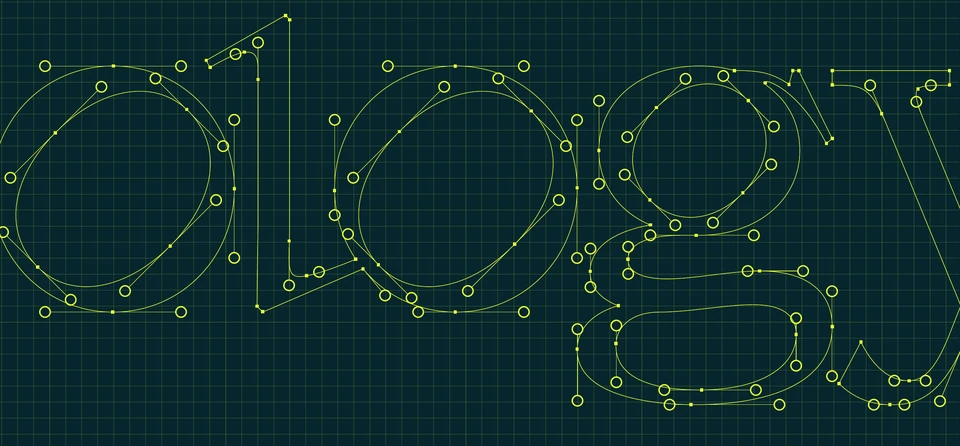
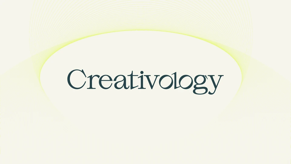
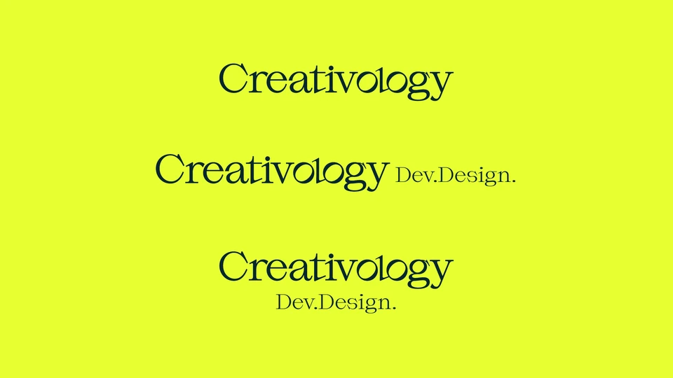
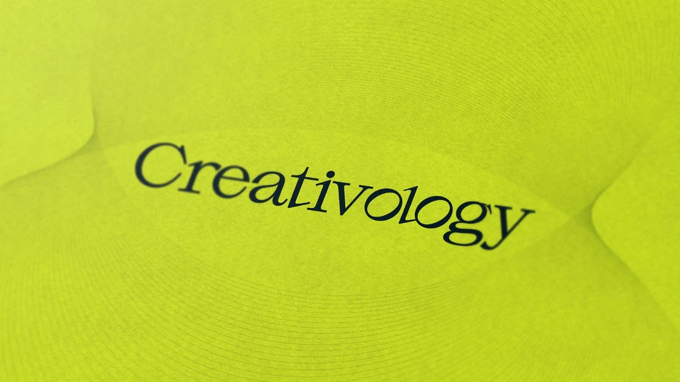
The logotype carries the anniversary inside the name itself. In the letters “olo”, the l and the o form the number 10, and the same letters read as the binary 010: a decade of craft and the code behind the work, held in a single word.
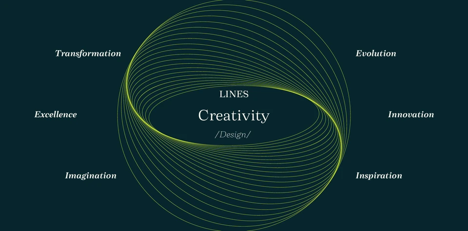
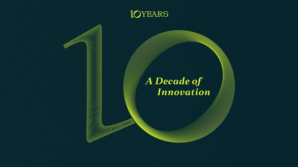
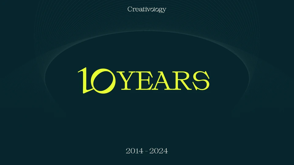
Three ideas shape the system. Creativity as design, drawn as a field of dynamic waves. Development through advancement, written in binary. And a decade of legacy, carried by the number 10.

Le Logo
A logotype and its descriptor
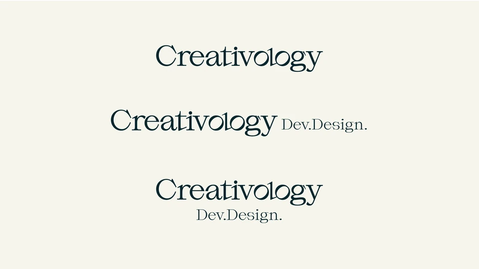
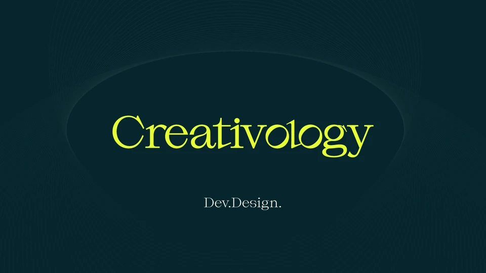
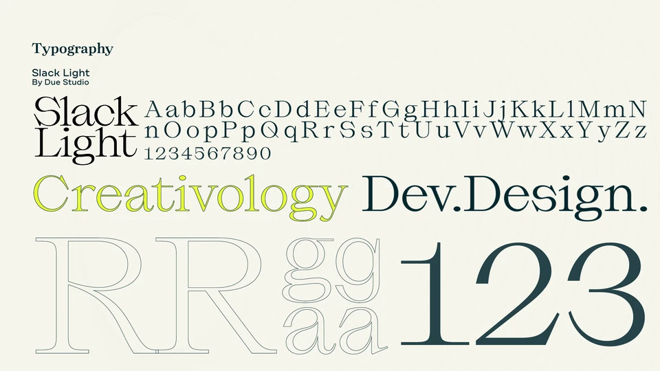
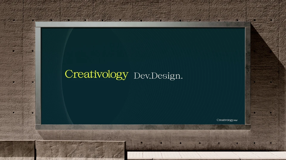
The wordmark is set in Slack Light by Due Studio, refined so the l and o lock together. Its descriptor, Dev.Design., folds the agency’s two divisions, development and design, into one short line that says what the studio does.
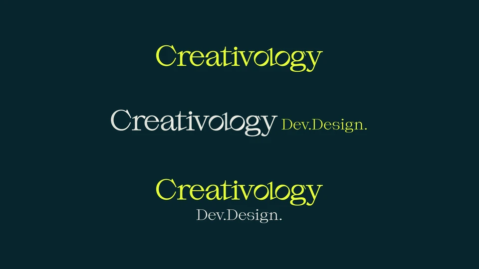
Three lockups cover every format: the wordmark alone, with the descriptor beside it, and with the descriptor stacked beneath.
Colour
Chartreuse, jungle green, alabaster
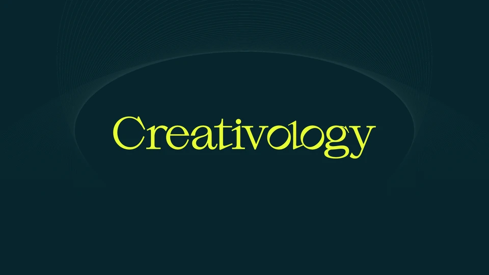
A phosphorescent chartreuse gives the brand its charge, set against a deep green-blue-grey and an off-white that keeps it calm.
- Chartreuse#E6FF32
- Dark Jungle Green#06262D
- Alabaster#F5F5EB
Typography
Slack Light, by Due Studio
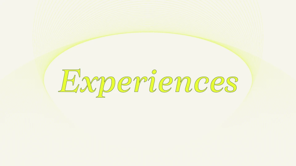
One expressive serif carries the voice, from the logotype to headlines, with its italics for the words that matter.
Dynamic Waves
A system in motion
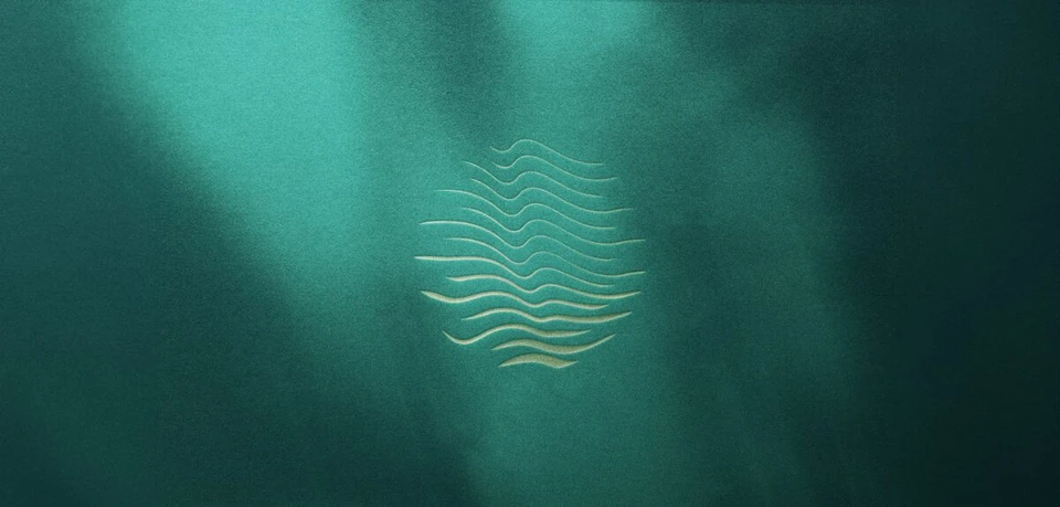
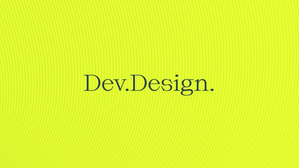
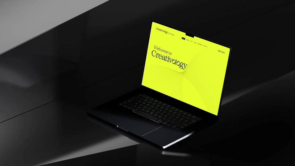
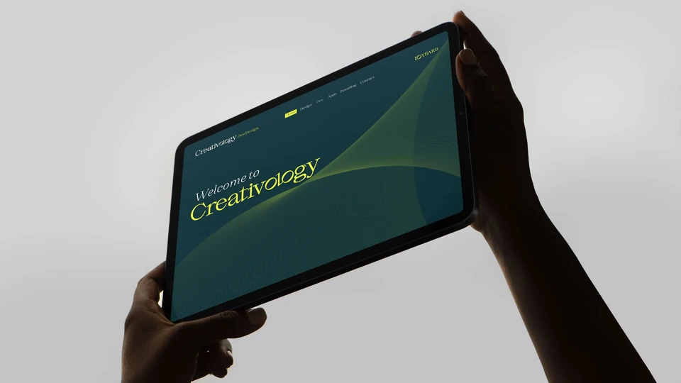
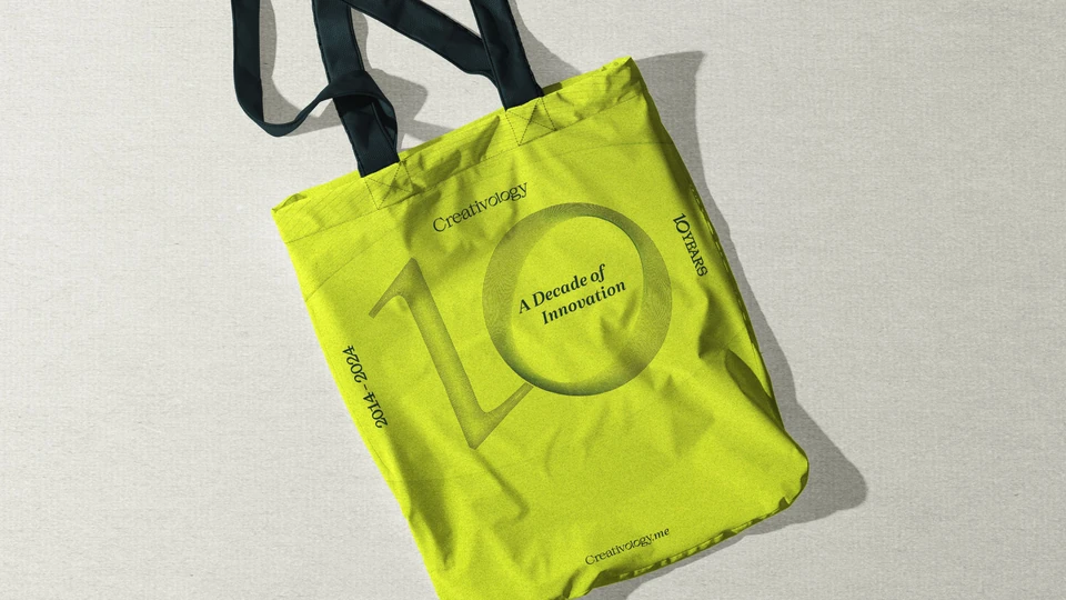
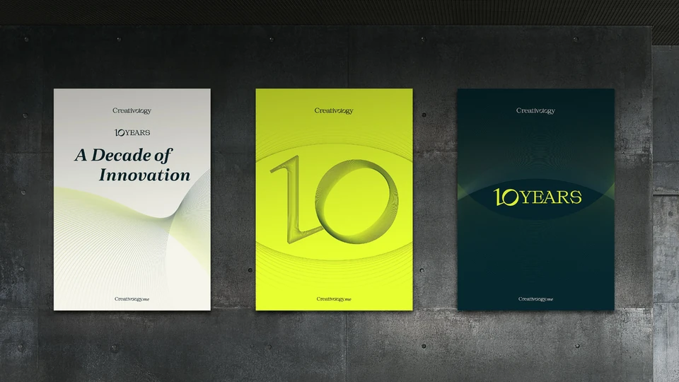
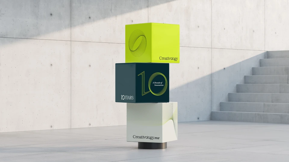
The Dynamic Waves System is the brand’s signature motif: fields of fine lines that bend and flow, symbolising the meeting of creativity and technology. It frames the logotype, carries the anniversary and gives every surface movement.
Applications
From screen to street
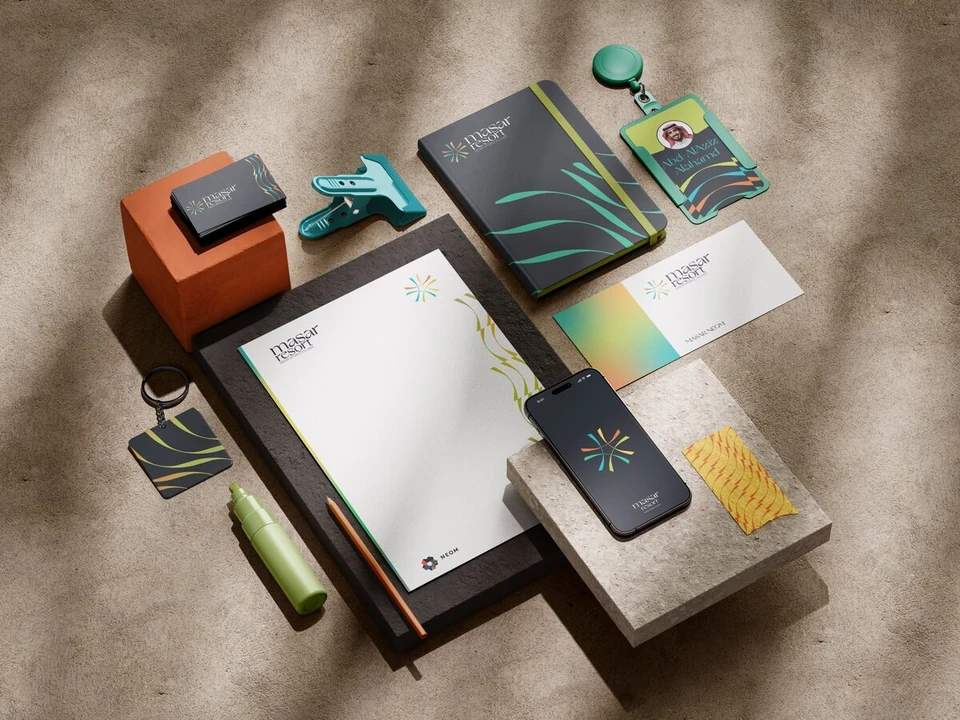
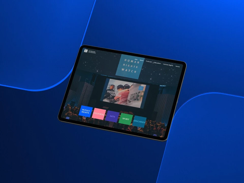
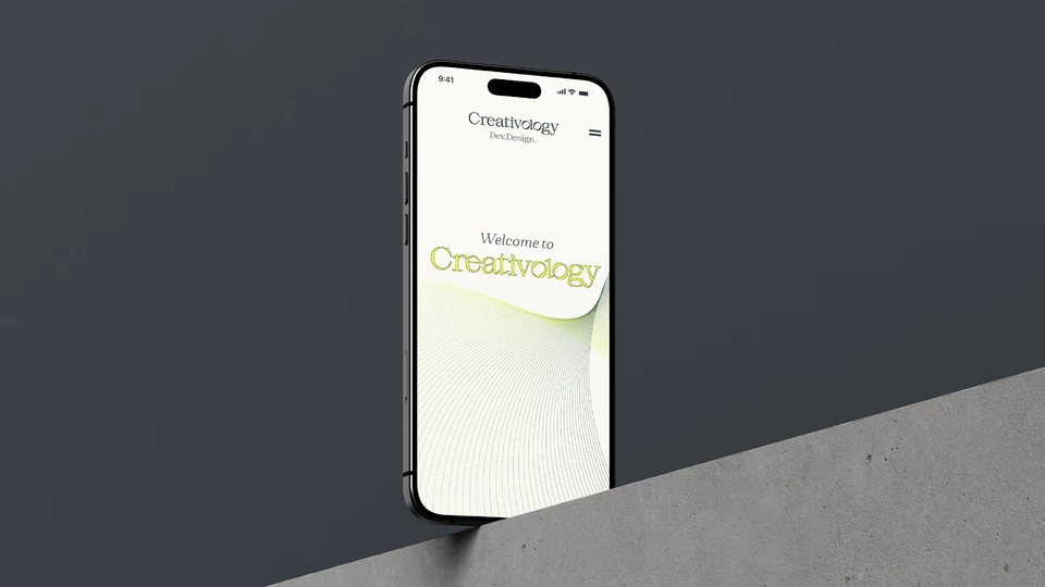
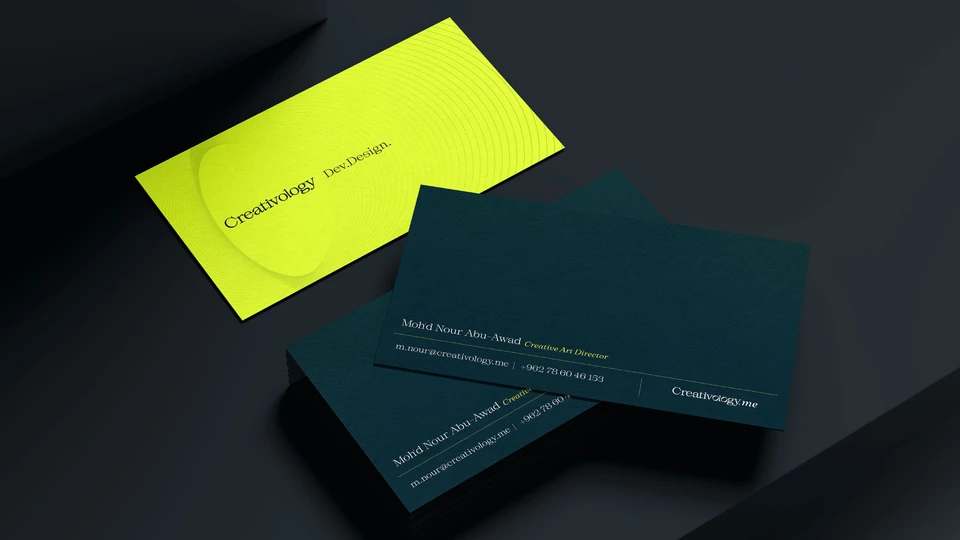
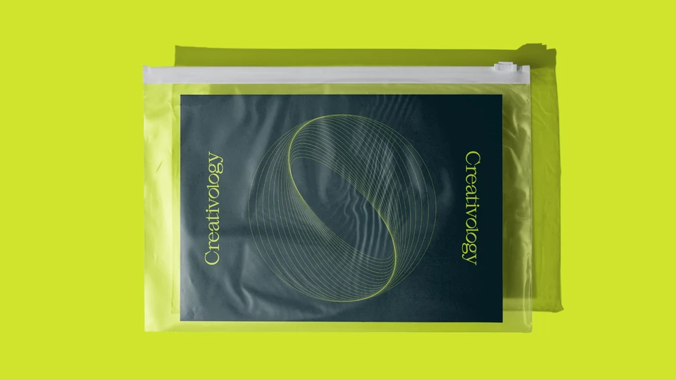
The identity rolls out across the new website and devices, stationery, merchandise and environmental graphics, each one carrying the waves, the colour and the hidden 10.
Deliverables
What we delivered
- 01
Research & Strategy
Analysis of ten years of the brand and a direction for the next decade.
- 02
Logotype & Descriptor
The Creativology wordmark with the hidden 10, and Dev.Design.
- 03
Visual Identity System
Colour, typography, the Dynamic Waves System and the 10 Years mark.
- 04
Digital
Website design across phone, tablet and desktop.
- 05
Print & Merchandise
Business cards, folders, posters, tote bags and ID badges.
- 06
Environment
Billboards and branded installations.
- Design & Art Direction
- Moh'd Nour Shahen
- Client
- Creativology