Zeryab Estates
Brand Identity · Luxury Residential
Zeryab Estates is a private luxury retreat nestled in the heart of Marrakech, Morocco — a city where centuries of Andalusian, Berber, and Arab cultures converge into something singular. The brief called for an identity that could hold all of that weight without collapsing under it.
- Client
- Zeryab Estates
- Location
- Marrakech, Morocco
- Year
- 2026
- Project Type
- Brand Identity
- Industry
- Luxury Residential
- Scope
- Visual Identity, Art Direction
01 — The Place
A Sanctuary Beyond Time
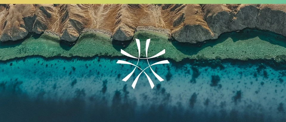
The property is defined by its relationship with time: ancient craft traditions, living architecture, and a natural landscape that has resisted change. The brand needed to speak to a discerning international audience while remaining deeply rooted in its place of origin — not as nostalgia, but as lived continuity.
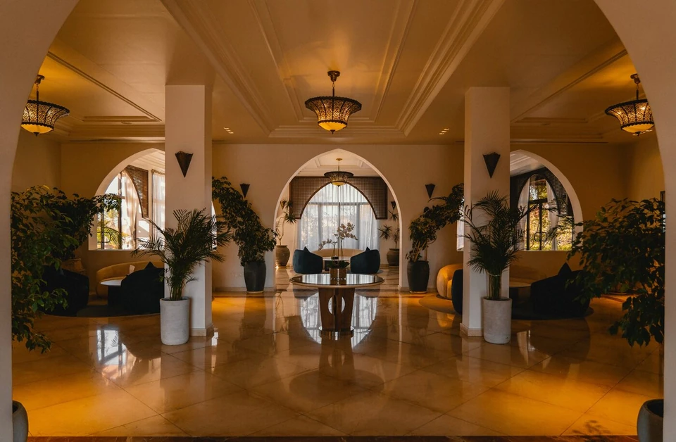
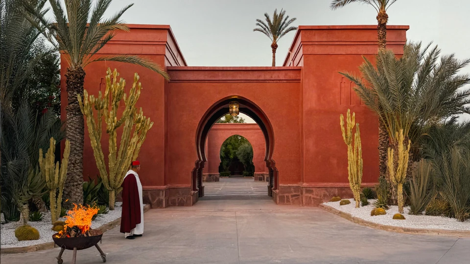
Heritage and nature frame every experience at Zeryab. Palm-shaded courtyards, Moorish arches reflected in still water, the scent of aged cedar and orange blossom — the identity had to translate this sensory world into a mark that travels across every material surface with the same quiet authority.
02 — The Inspiration
Centuries of Craft
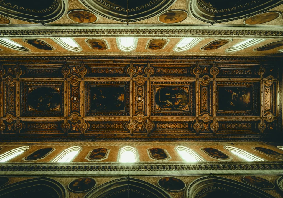
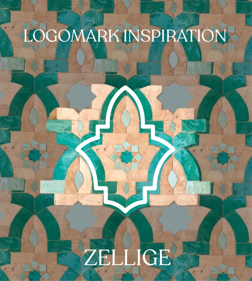
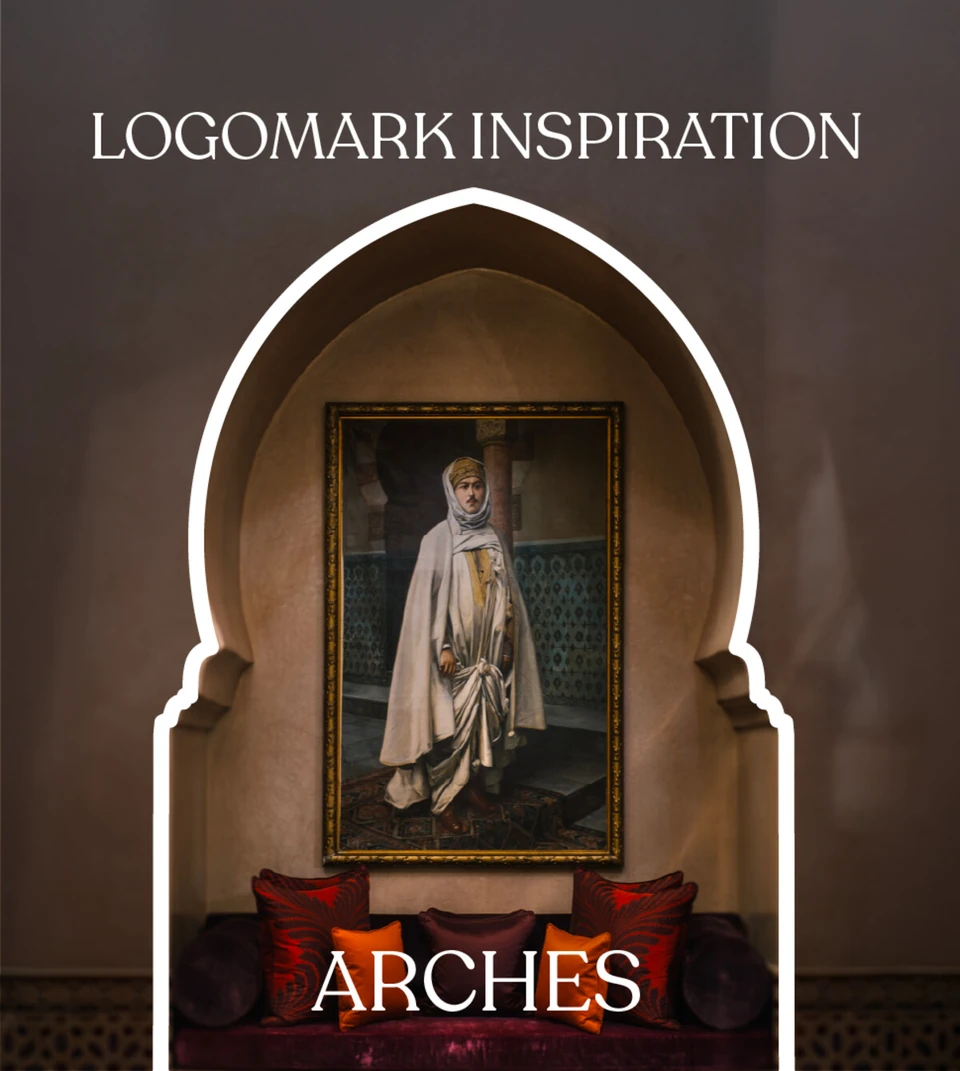
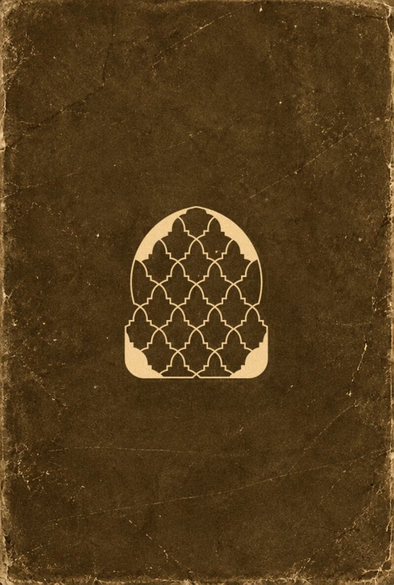
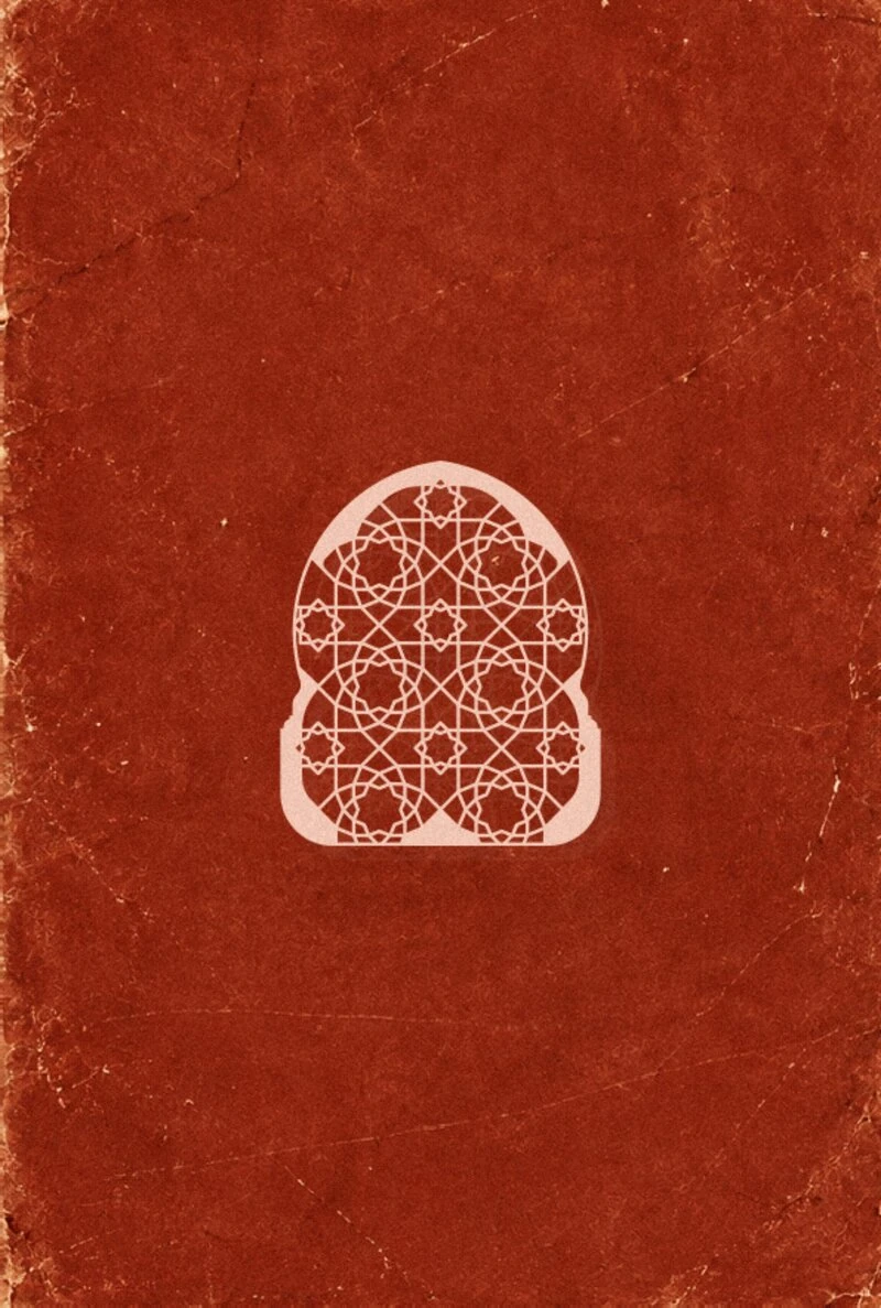
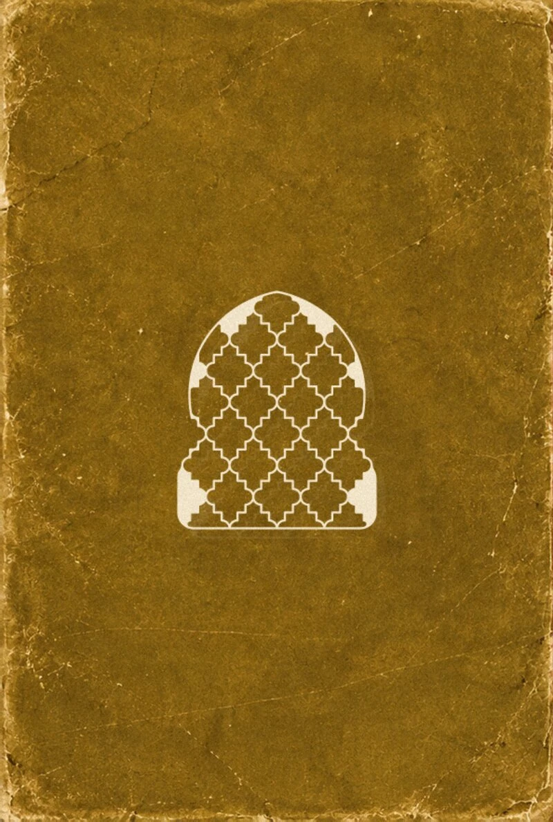
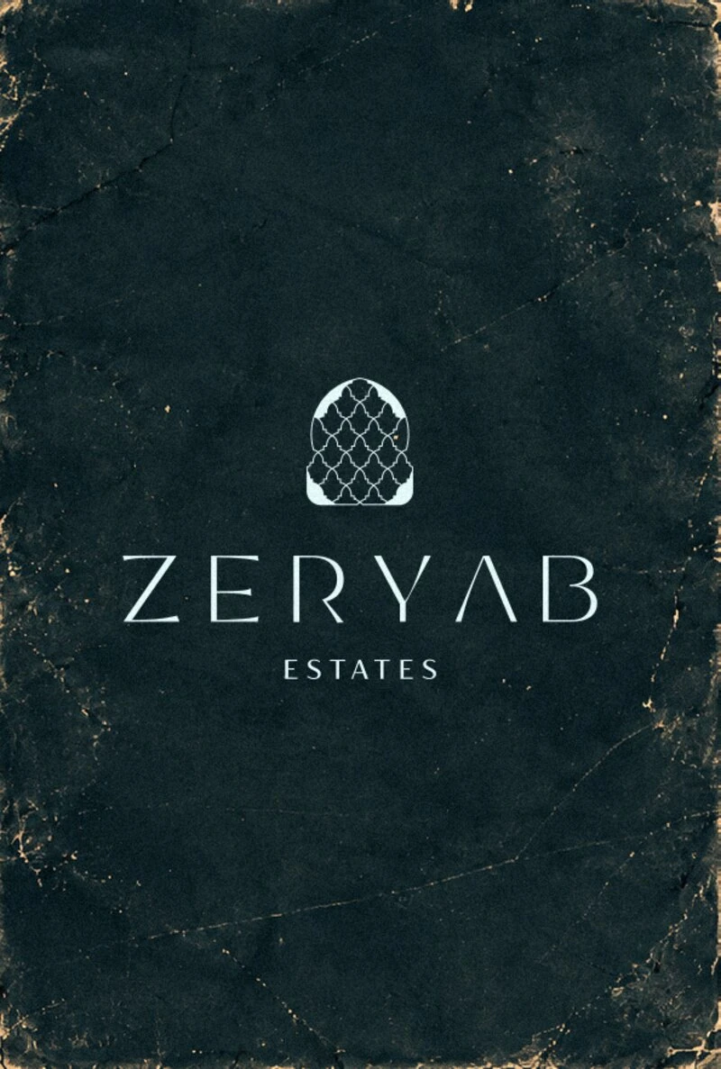
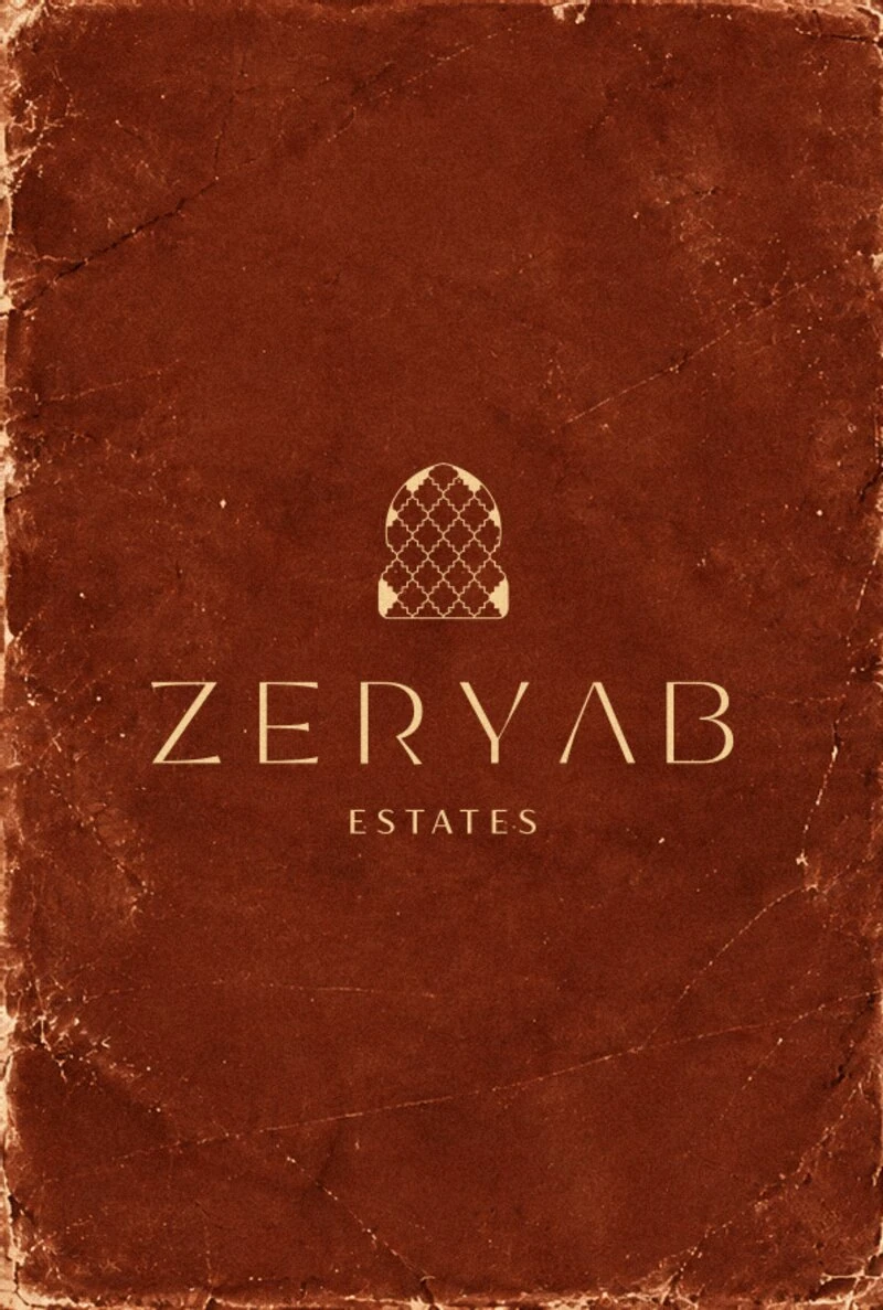
The logomark draws from two of Morocco's most enduring visual traditions: the pointed Moorish arch and the interlocking geometry of Zellige tilework. Both carry the same underlying logic — infinite complexity generated from a single, precise rule. The arch frames space; the Zellige fills it. Together they define the visual language of Moroccan sacred and domestic architecture.
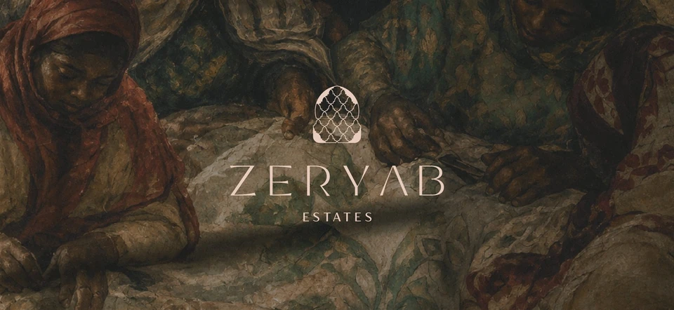
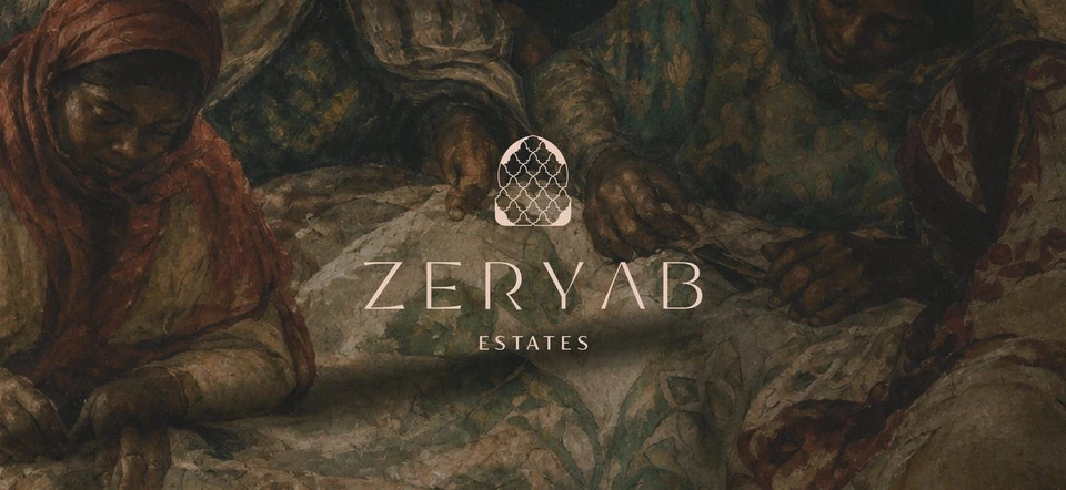
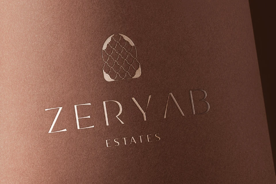
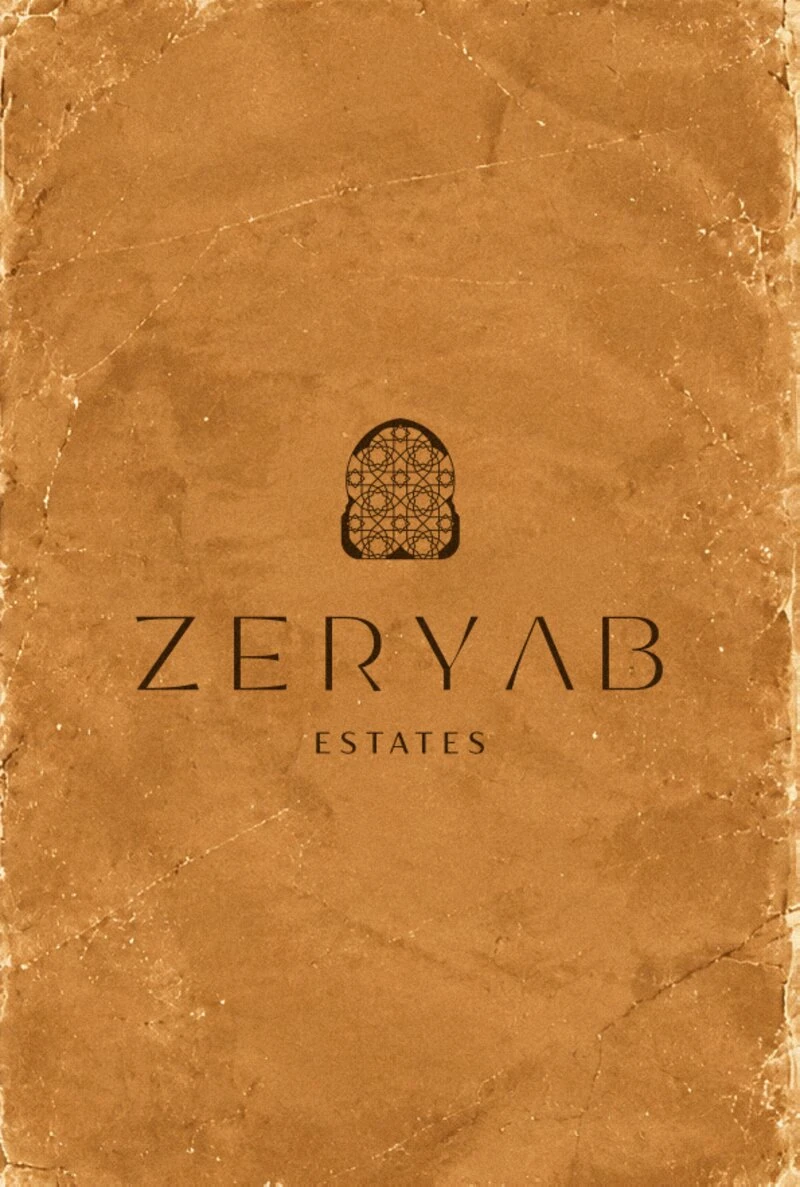
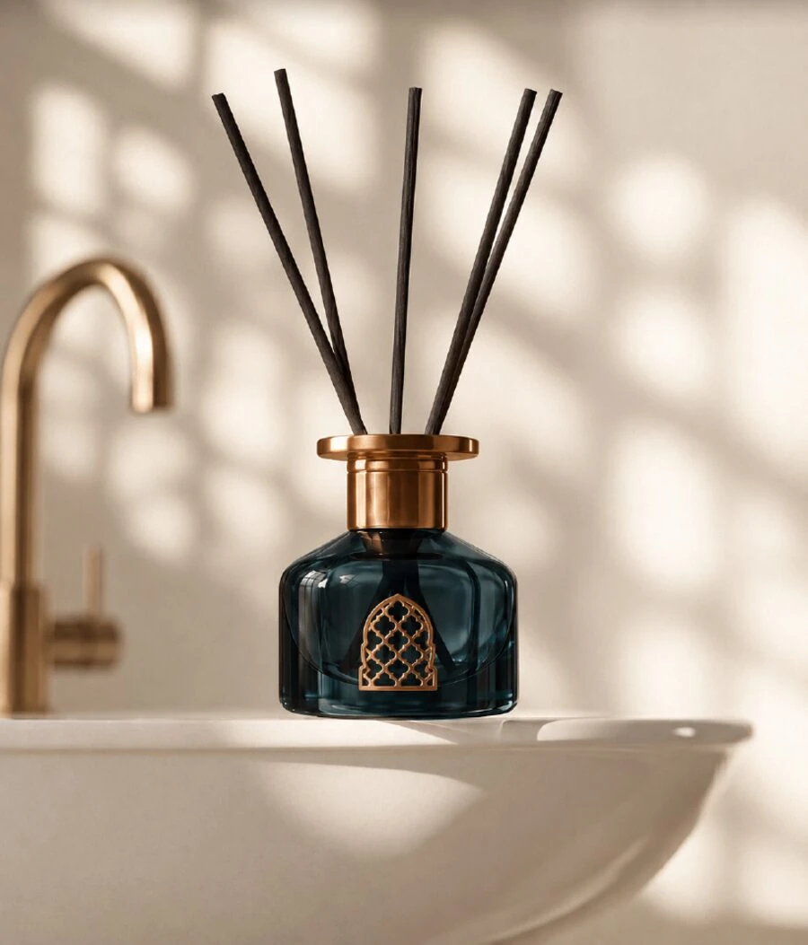
The mark abstracts these references into a singular geometric emblem: an arch outline that, on closer inspection, reveals a Zellige-derived interlocking pattern at its core. It reads immediately as place without resorting to ornamental cliché. It is architectural, not decorative — structured, not nostalgic.
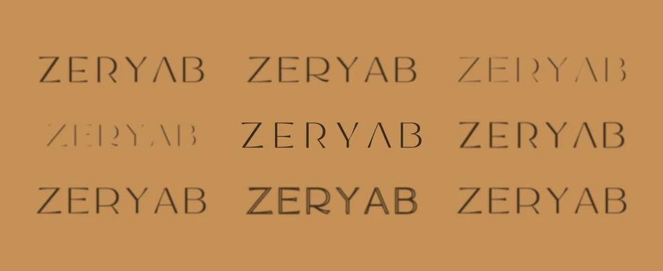
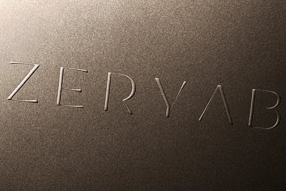
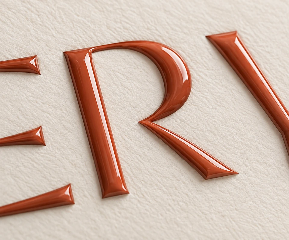
Typography was equally deliberate. Extensive exploration of letterform weights, spacing, and proportion resulted in a custom-spaced wordmark that balances the geometric rigidity of the mark with an open, breathing quality. The letters feel carved rather than printed — solid enough for embossing, refined enough for fine stationery.
03 — The Identity
Heritage Reimagined
The final identity system is built around the architectural logomark — a clean geometric form that holds its own at any scale, from embossed collateral to signage, from a wax seal to a digital favicon. The wordmark ZERYAB ESTATES uses wide-tracked uppercase lettering with custom spacing that gives the name the presence of an inscription.
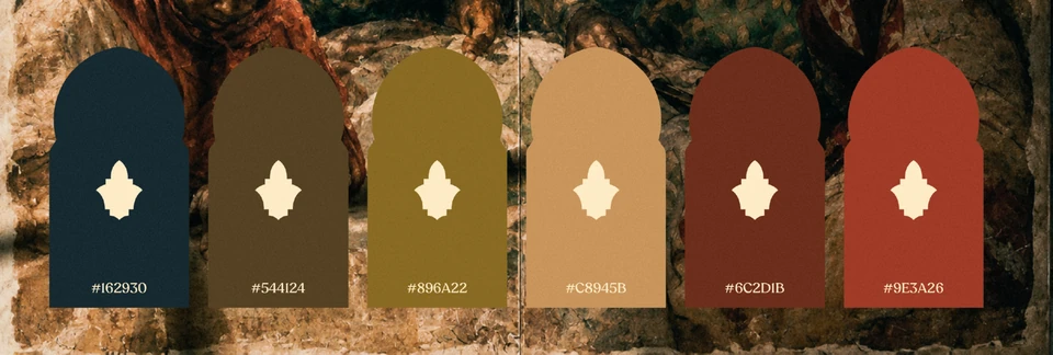
Six brand colors extracted directly from the Marrakech landscape — deep navy, dark umber, olive gold, sand tan, deep terracotta, and burnt red — form a palette that feels simultaneously timeless and specific to place. These are not decorative choices; they are materials translated into color: the charcoal of hammered iron, the warmth of hand-pressed clay, the oxidised gold of aging copper.
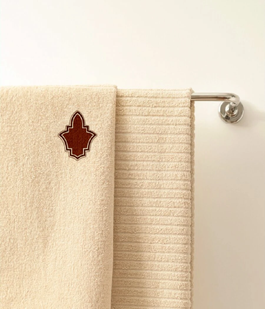
The system was designed for permanence. Every decision was tested against the materials it would live on: heavily textured papers, metallic foils, raw clay surfaces, woven textiles. The identity performs equally at the two extremes of luxury hospitality — the intimacy of a guest welcome card, and the authority of an architectural façade plaque.
04 — Colors & Typography
The Palette of Marrakech
Each color in the system was chosen for its resonance with the physical world of Marrakech — the deep navy of tile shadow, the umber of cedarwood grain, the gold of polished brass lanterns, the tan of sun-dried clay, the terracotta of handmade bricks, the burnt red of poured iron. The palette reads cohesively across print and digital, in natural light and candlelight.
Typography bridges the historical and the contemporary. Display text uses elegantly spaced uppercase lettering with fine optical adjustments — a voice that belongs in both a riad guestbook and a contemporary art catalogue. Body text remains restrained and readable, giving the display work room to breathe.
05 — Visual Applications
Where the Brand Lives
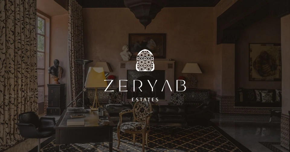
A luxury hospitality brand earns its credibility through the quality of its physical touchpoints. For Zeryab Estates, every printed piece was approached as a craft object — not a reproduction of the identity, but a new expression of it. The weight of the paper, the depth of the emboss, the warmth of a hand-applied wax seal.
The application system spans stationery, welcome collateral, hospitality amenities, textile branding, and architectural signage. Each surface demanded a different interpretation of the core mark — sometimes reduced to a single embossed letterform, sometimes expanded into an environmental graphic that fills an entire wall.
- #162930
- #544124
- #896A22
- #C8945B
- #6C2D1B
- #9E3A26
Deliverables
What Was Built
- 01
Visual Identity System
Complete logomark, wordmark, and brandmark suite with usage guidelines across light, dark, and textured surfaces.
- 02
Brand Color Palette
Six-tone palette sourced from the Marrakech landscape with CMYK, RGB, and Pantone specifications.
- 03
Typography Direction
Custom wordmark spacing, primary and secondary type system, and hierarchy guidelines for print and digital.
- 04
Brand Stationery
Letterhead, envelope, and business card system with print-ready specifications and material recommendations.
- 05
Hospitality Touchpoints
Welcome kit collateral, amenity packaging, textile branding, and reed diffuser bottle identity applications.
- 06
Art Direction
Full visual direction for photography, material selection, texture applications, and embossing specifications.
- Art Direction & Design
- Moh'd Nour Shahen
- Project Coordination
- Heba Zalloum
- Photography
- Roy Celysian
- Studio
- Lōn Visuals