Muscat Tech Week
Event Identity · Technology
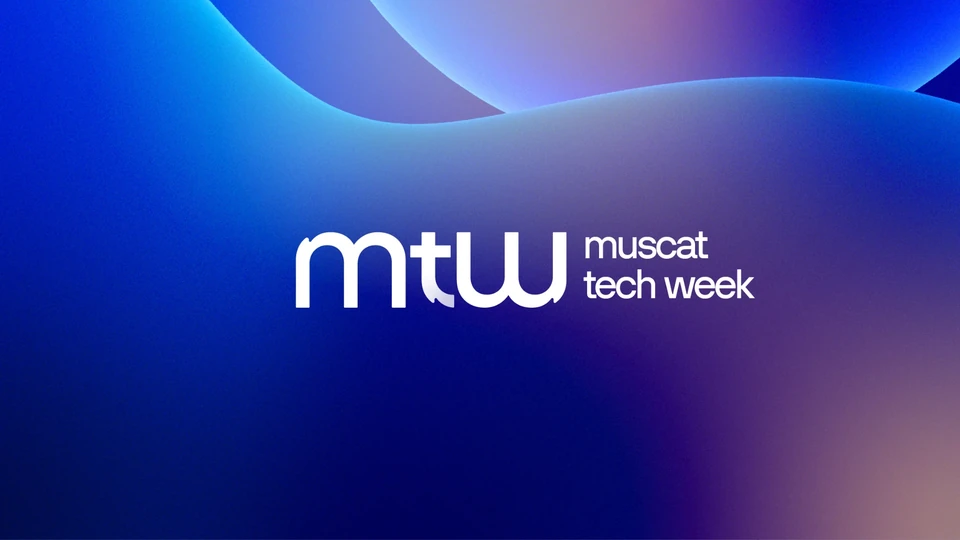
An identity for Muscat Tech Week that draws its soul from Oman’s evening skies: a lowercase monogram with a khanjar’s curve, and a sunset palette carried from the logo to the main stage.
- Client
- Pitlane Live
- Location
- Muscat, Oman
- Year
- 2025
- Project Type
- Event Identity
- Sector
- Technology · Events
- Scope
- Logo, Colour, Typography, Campaign, Event
Overview
The world is coming to Oman
Muscat Tech Week brings the region’s technology community to Oman’s capital, organised by Pitlane Live with the Sultanate’s Ministry of Transport, Communications and Information Technology.
Its identity had to stand beside the world’s leading tech events and still be unmistakably Omani: global in form, rooted in place.
The Landscape
Among the world’s tech events
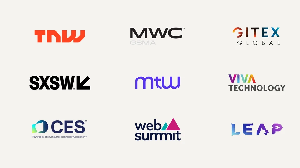
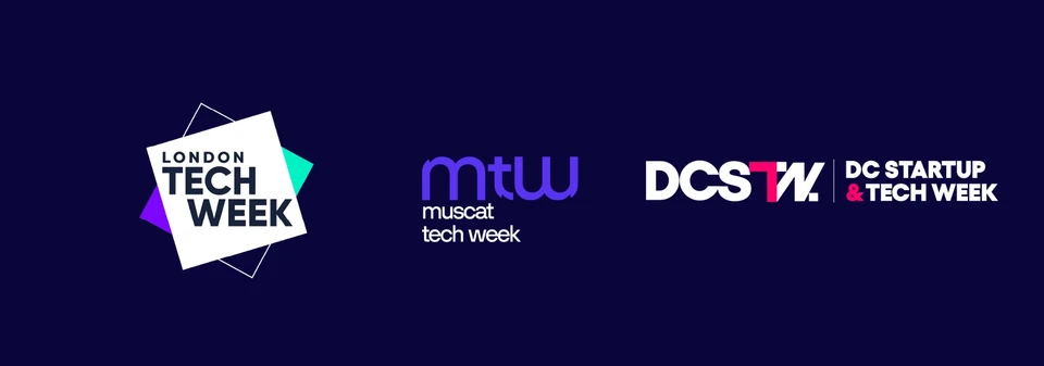
The great tech gatherings, from Web Summit and GITEX to SXSW and LEAP, are known by short, confident marks. Tech weeks from London to Washington DC share the same language.
Muscat Tech Week needed to take its place in that company: a compact symbol that reads instantly at every scale, with a character of its own.
Logo Concept
A monogram with Omani roots
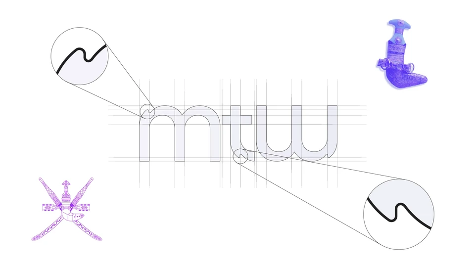
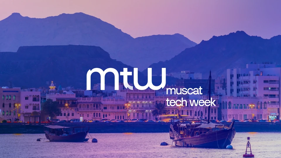
The “mtw | muscat tech week” logo represents a clean, global and tech-forward identity. Designed in all lowercase, it communicates simplicity, accessibility and innovation. The core symbol “mtw” serves as a strong visual anchor, much like other leading tech events, while remaining adaptable across digital and physical touchpoints.
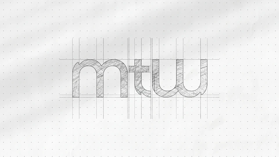
As a subtle tribute to Omani heritage, the letter “t” features a small serif with a rounded shape, crafted to echo the curve of the traditional Omani khanjar: not in a literal or obvious way, but as a respectful design reference. The “m” and “w” are mirrored reflections of each other, reinforcing the design’s balance and symmetry and adding a modern, cohesive rhythm. Together, these elements preserve a sense of place within a globally recognisable form.
The Logo
One mark, every scale
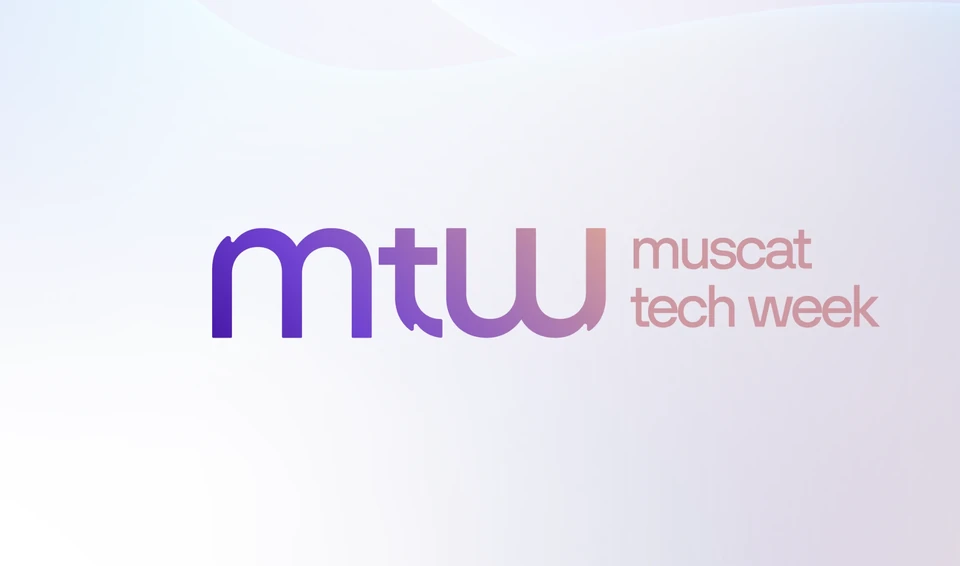
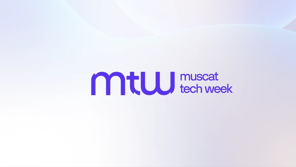
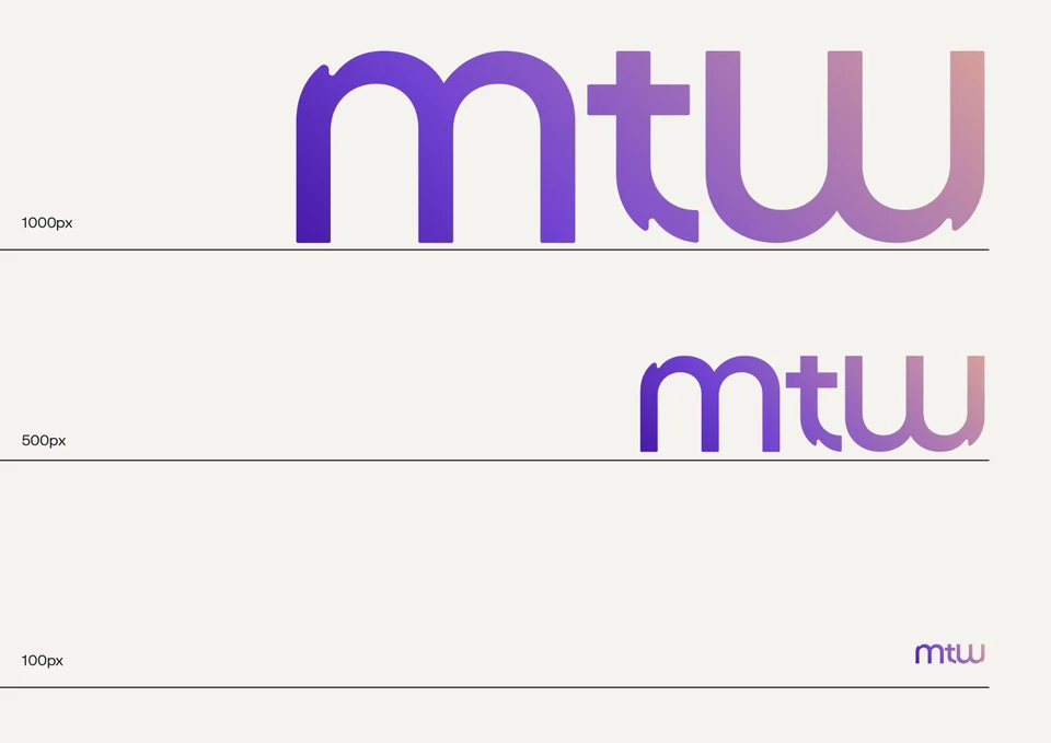
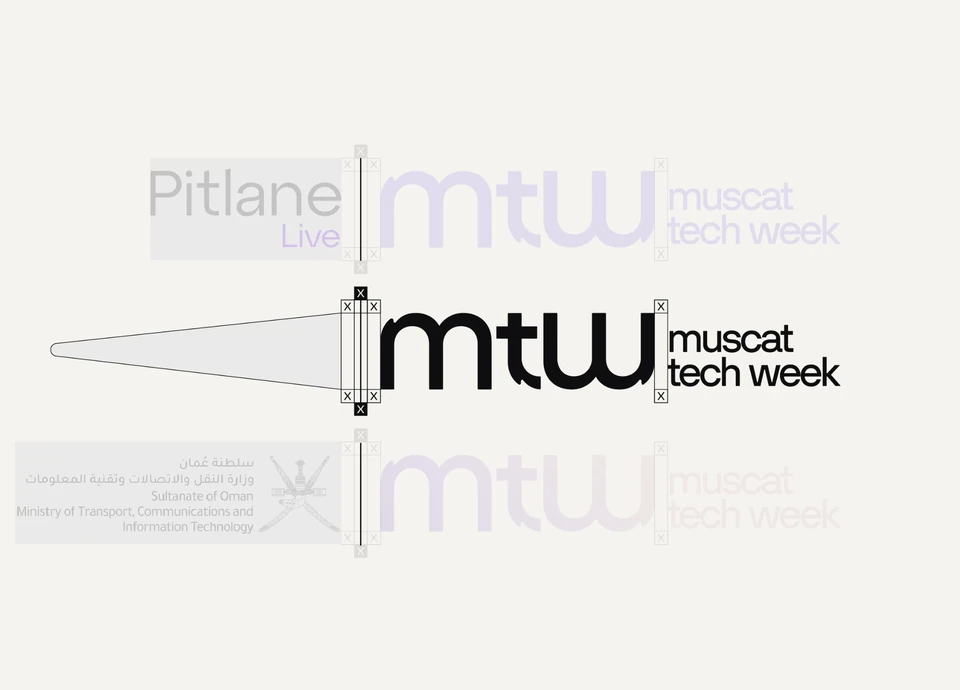
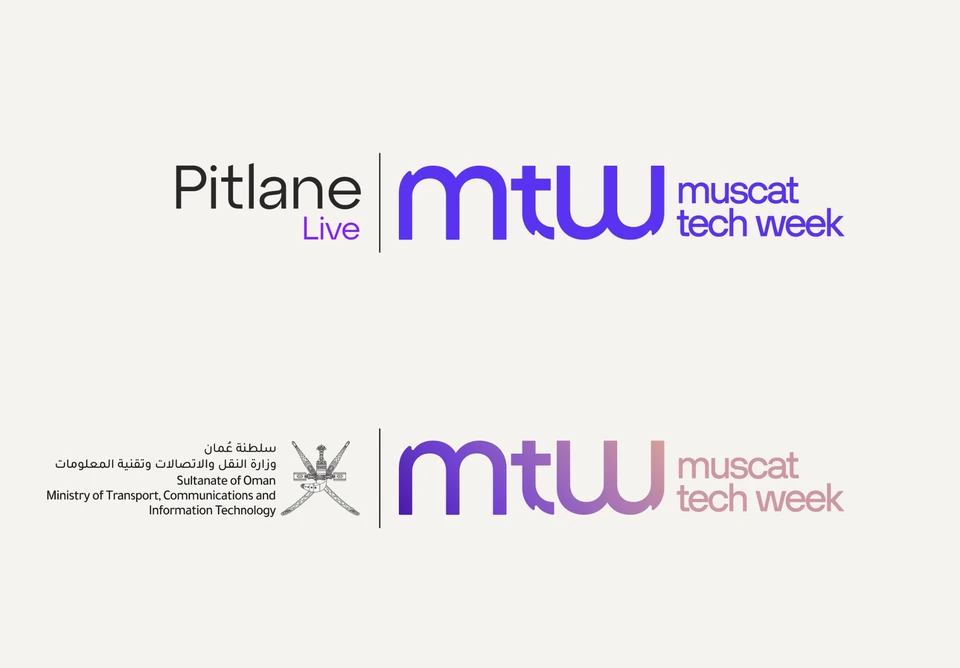
The monogram and its wordmark work as a single lockup, in the sunset gradient or in a single violet, and hold their shape from a 1000-pixel stage graphic down to a 100-pixel favicon.
Color Concept
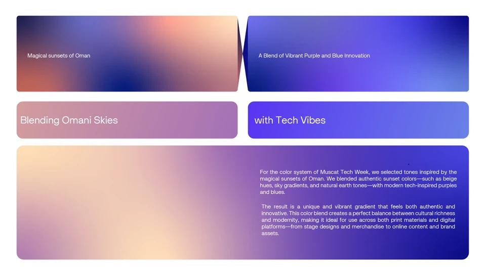
Inspired by Oman’s magical sunsets
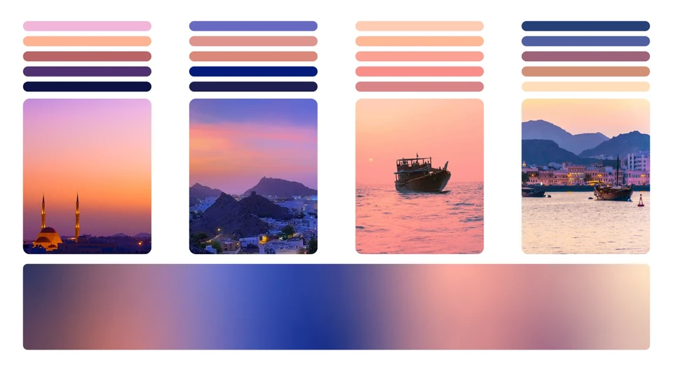
The visual identity of Muscat Tech Week draws its soul from the breathtaking magic of Oman’s evening skies. The gradient palette is inspired by the natural harmony of sunset in Muscat, where deep indigo transitions into violet, then soft amber and golden hues melt into the cityscape.
This carefully designed colour system reflects both modern innovation and cultural depth. It captures the warmth of Omani hospitality, the richness of its heritage, and the rising energy of its future in technology. The palette works seamlessly across digital and physical mediums, on screens, stages, signage and merchandise, while remaining rooted in a sense of place.
This sunset isn’t just a view. It’s a symbol of transition, of energy, and of the promise that every new idea brings a new dawn.
Key Visuals
The sky as a canvas
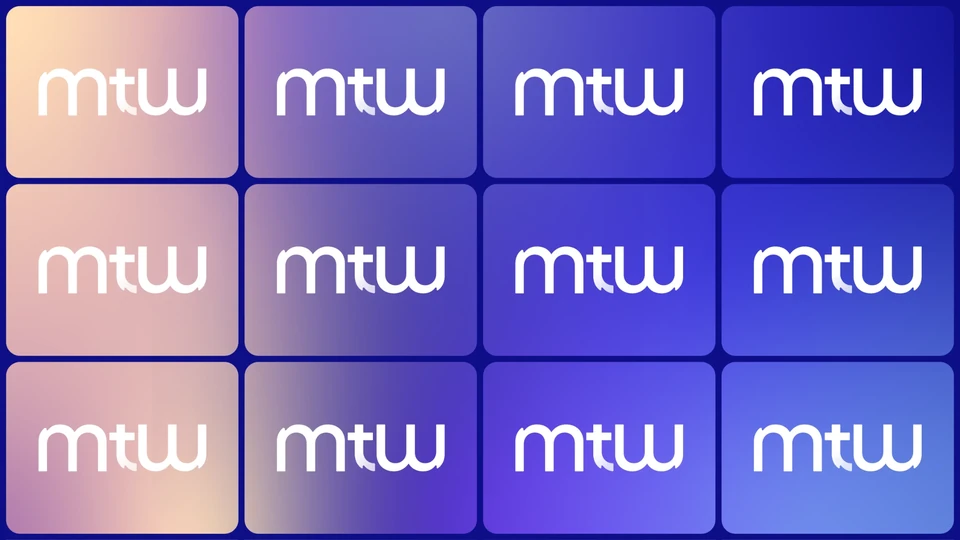
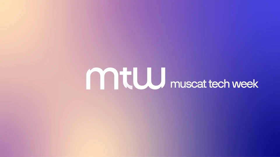
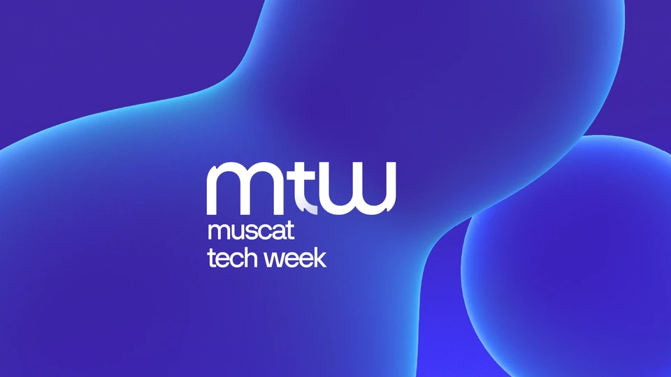
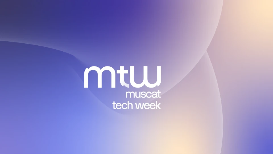
Soft, layered gradients become the brand’s key visuals: fields of indigo, violet and amber that carry the logo across screens, stages and print, and change mood with the light of the day.
Typography
One voice, two scripts
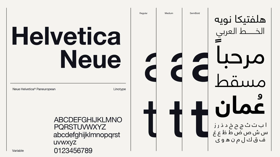
Neue Helvetica carries the identity in both English and Arabic: a neutral, global sans in Regular, Medium and SemiBold that lets the monogram and the colour lead, and gives Arabic headlines the same clarity as English ones.
Campaign
From every place, the destination is Oman
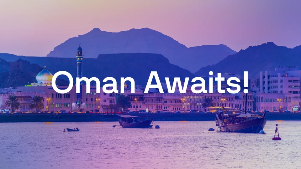
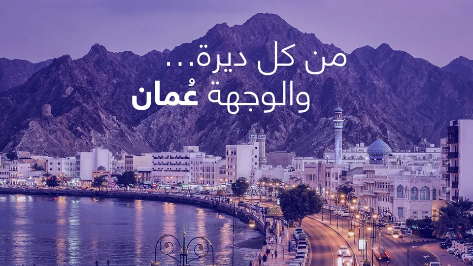
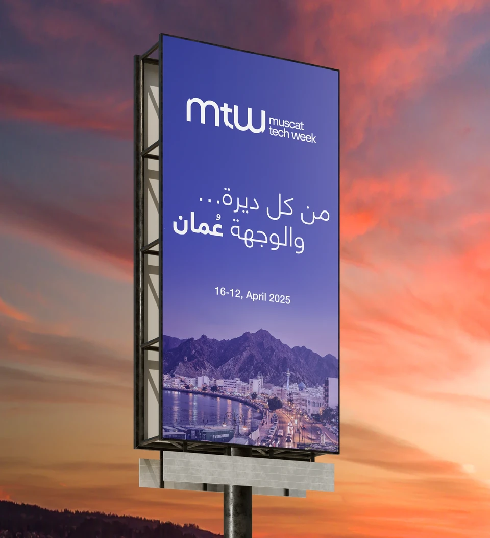
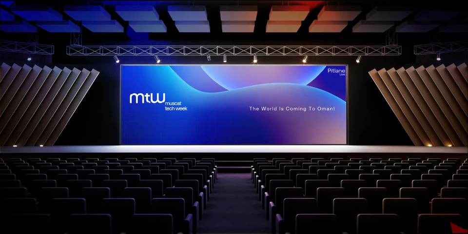
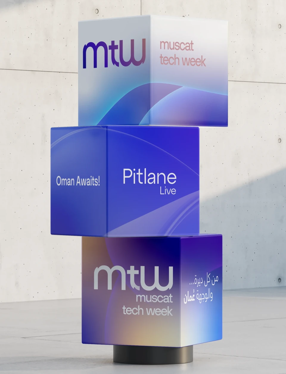
The campaign speaks to visitors in two languages. In English, “The World Is Coming To Oman!” and “Oman Awaits!”; in Arabic, “من كل ديرة… والوجهة عُمان”, from every place, the destination is Oman.
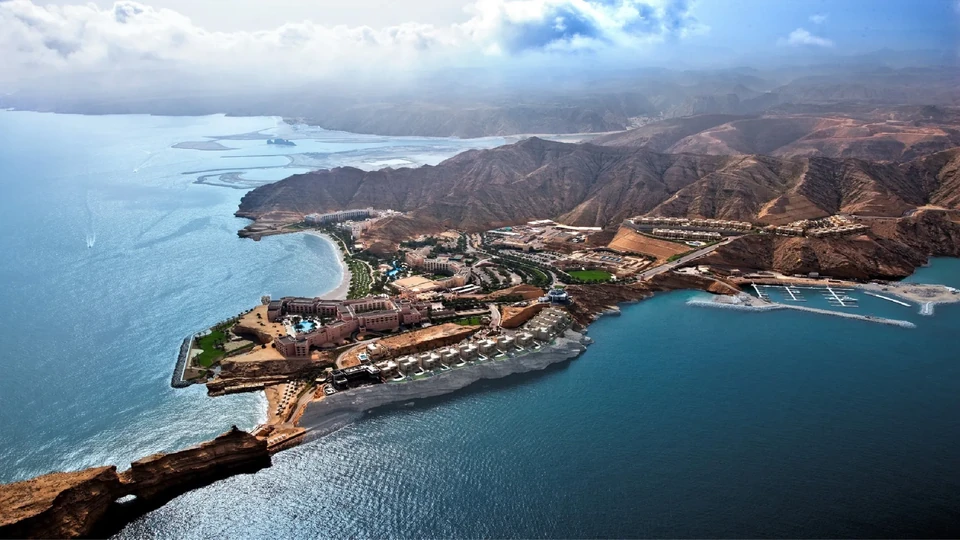
Each line is set over Muscat itself, its corniche, mountains and harbour washed in the identity’s indigo dusk.
The Event
On stage, on site
At the event the identity becomes the room: the main-stage screen, delegate badges and lanyards, and branded installations across the venue.
Deliverables
What we delivered
- 01
Logo & Monogram
The mtw monogram and wordmark, built on a construction grid.
- 02
Logo System
Clear space, scale and co-branding with Pitlane Live and the Ministry.
- 03
Colour System
A sunset gradient palette for screen, stage, signage and merchandise.
- 04
Typography
Neue Helvetica for English and Arabic.
- 05
Campaign
Bilingual campaign lines, key visuals and outdoor.
- 06
Event Branding
Main stage, badges, lanyards and on-site installations.
- Design & Art Direction
- Moh'd Nour Shahen
- Organiser
- Pitlane Live