
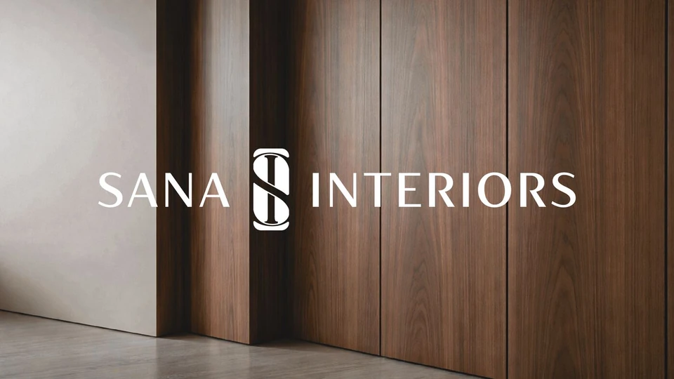
Sana Interiors
Interior Design · Brand Identity
A complete identity reconstruction for a growing interior design studio — from a minimal Arabic wordmark to a refined, contemporary monogram with architectural depth.
- Client
- Sana Interiors
- Location
- Amman, Jordan
- Year
- 2025
Project Overview
From a personal signature to a complete visual identity built for scale.
Sana Interiors began with a simple Arabic logo that served the early stage of the brand. As the studio grew into a recognised name in residential and commercial interior design, the need for a stronger, more premium presence became clear.
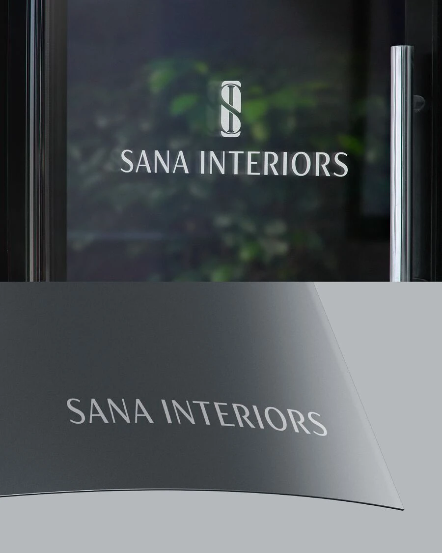
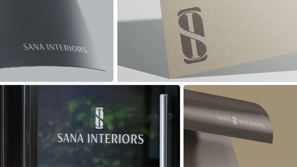
The new identity was developed from the ground up — introducing a distinctive SI monogram, a refined custom logotype, and a full visual system grounded in the textures and materials of architectural space.
The Icon
S meets I — a fluid architectural fusion.
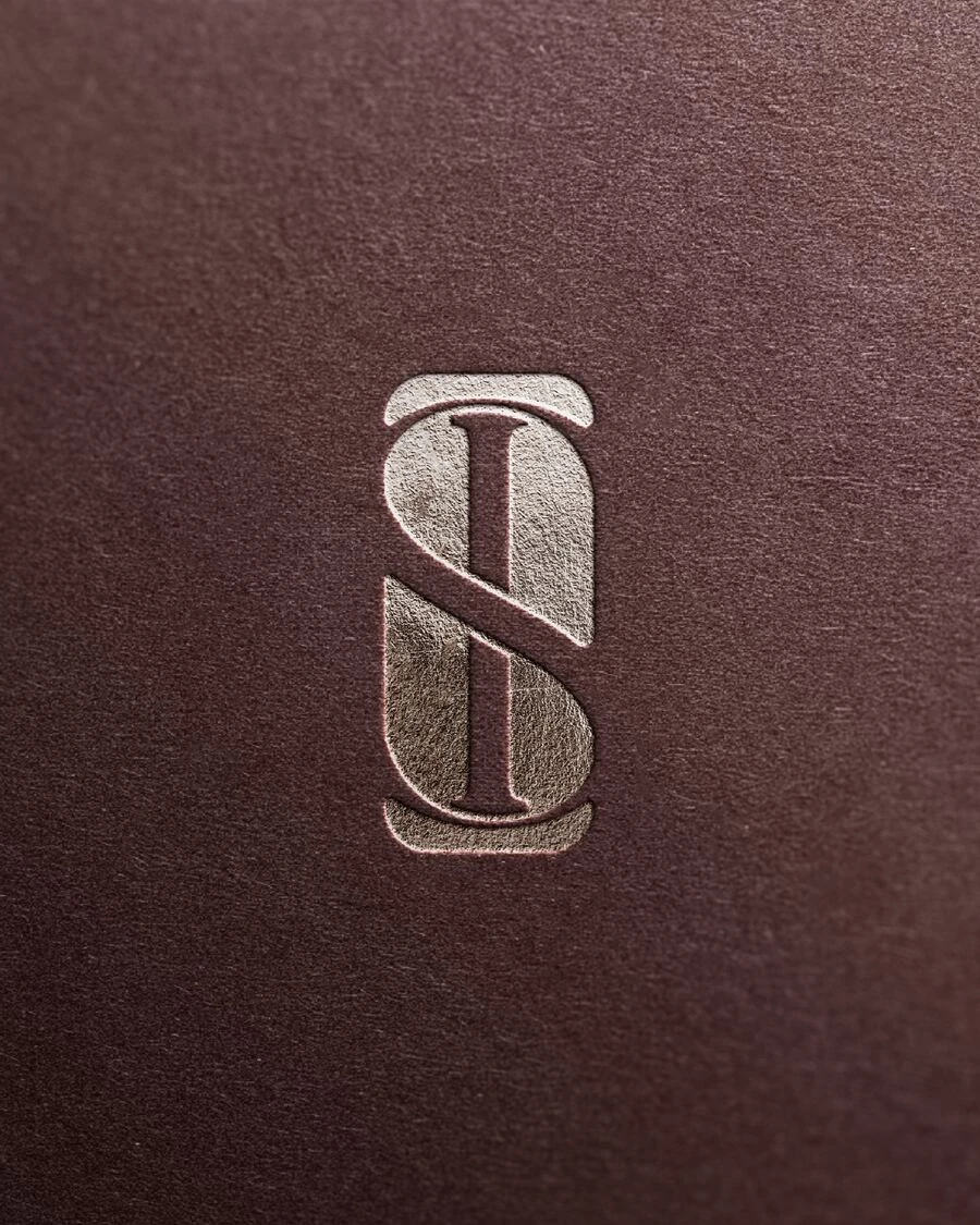
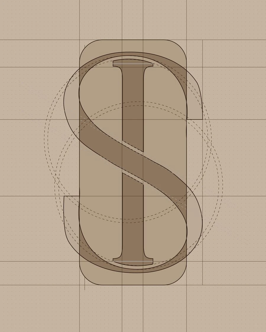
The visual icon was developed by abstractly merging the initials S and I. Rather than a literal typographic mark, the letters were transformed into a fluid architectural form where curves and vertical structure interact to create a balanced symbol.
The vertical element represents structure and stability, while the flowing S-curve introduces movement and spatial harmony — reflecting the relationship between architecture and the interior space it contains.
- S
Movement
The flowing curve — spatial harmony and organic flow.
- I
Structure
The vertical axis — precision, stability, architecture.
- ∞
Balance
The unified mark — minimal yet unmistakably distinct.
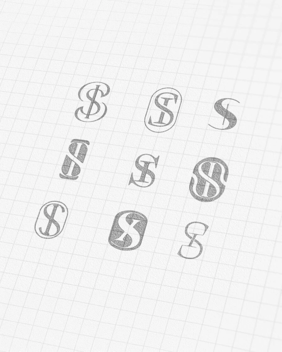
Logo System
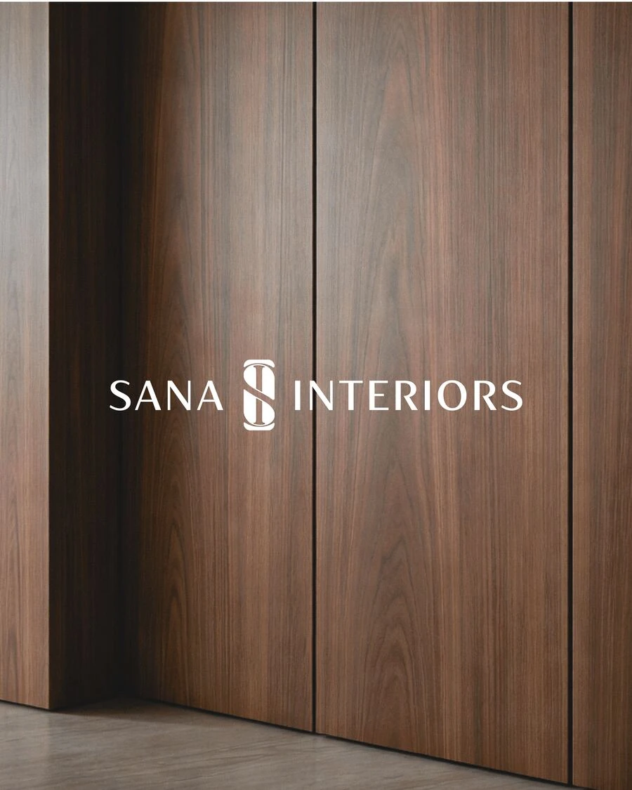
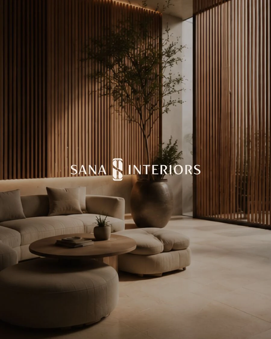
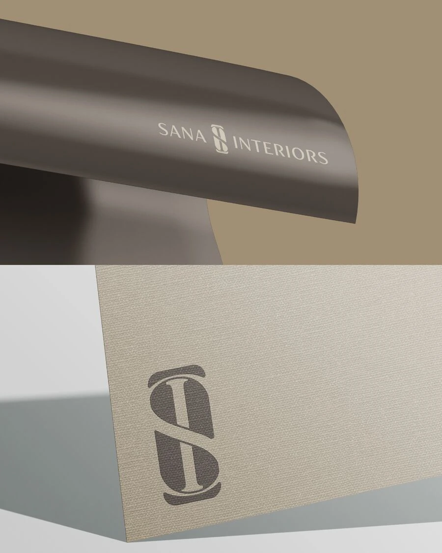
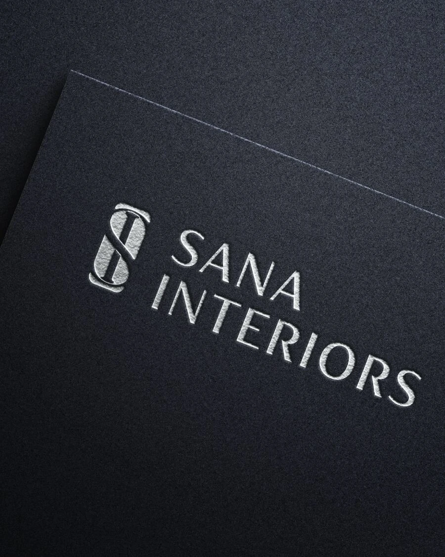
Brand Atmosphere
Inspired by material.
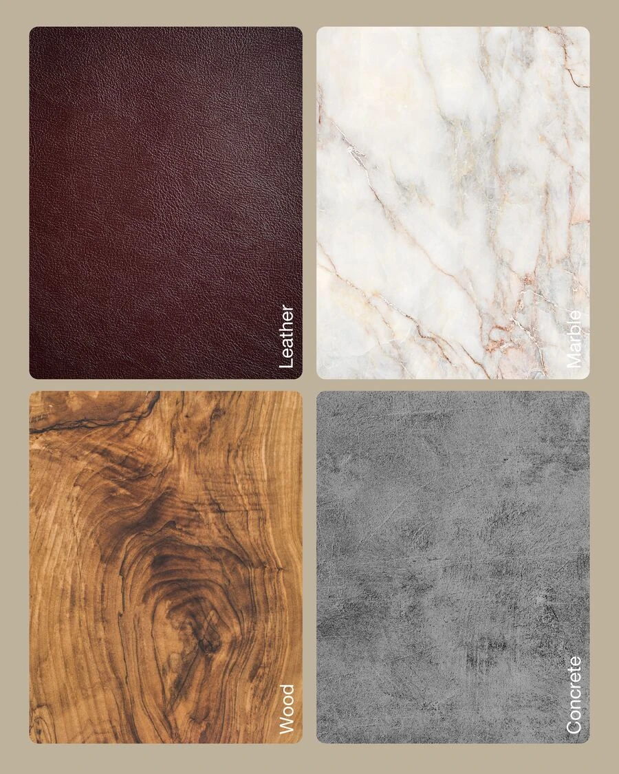
The visual atmosphere of Sana Interiors is inspired by natural architectural materials commonly found in interior spaces.
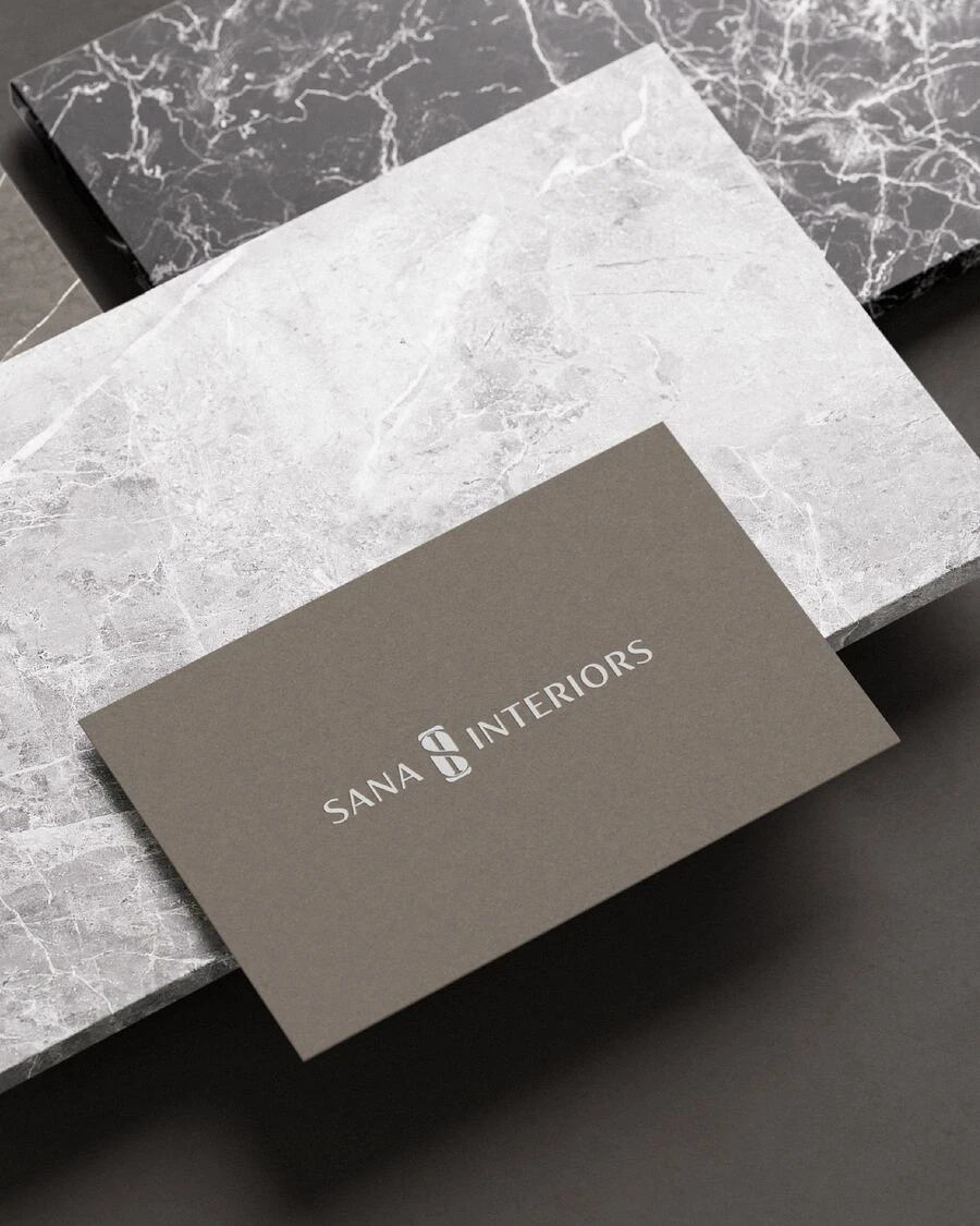
Textures such as leather, marble, wood and concrete reflect the brand’s balance between refined elegance and contemporary structure. These materials express warmth, depth and authenticity while reinforcing the brand’s semi-luxury and architectural character.
Together, they create a tactile and sophisticated visual environment that supports the identity across brand imagery and communication.
Colour Palette
Warm neutrals drawn from the brand's material world — from Oxblood leather to alabaster marble, from raw concrete to walnut wood.
- Oxblood#4A3B35
- Warm Taupe#7A6A5A
- Sand#B5A99A
- Alabaster#DDD8D0
- Charcoal#1A1A1A
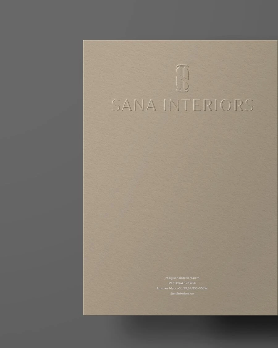
Stationery & Print