



Wakers 17 Coffee & Juice
Brand Identity · F&B
A vibrant, character-led café brand built around the spirit of the confident adventurer — bold enough to be recognised on any street in Amman.
- Client
- Wakers 17 Coffee & Juice
- Location
- Amman, Jordan
- Year
- 2023
Brand Strategy
Creativity begins here.
Wakers17 was imagined as more than bricks and mortar: a Coffee House that grows into an artistic and cultural community, a vibrant hub where creators, thinkers and environmental enthusiasts meet.
That idea is the strategy behind everything that follows. Every colour, word and touchpoint is made to serve it.
Brand Purpose
To inspire creative self-expression.
The purpose is to turn a café into a crucible where ideas are conceived, thoughts are nurtured and environmental awareness flourishes, pushing past the boundaries of a typical coffee shop and rippling well beyond its walls.
Brand Personality
The Confident Adventurer.
Wakers17 is built on confidence and an adventurous spirit: a haven for people who move through life with self-assurance and an unquenchable thirst for exploration.
It meets challenges head-on, embraces the unfamiliar with courage, and invites its guests to step into the unknown, make real connections and seize every moment.
Brand Essence
Our four values
- 01
Unyielding Confidence
Empowering growth through self-assurance.
- 02
Fearless Exploration
Embracing the unknown with bold curiosity.
- 03
Vibrant Engagement
Connecting hearts, kindling conversations.
- 04
Enduring Inspiration
Igniting motivation that stands the test of time.
Key Traits
How the brand behaves
- 01
Assured
A space where hesitation is replaced with conviction.
- 02
Engaging
Not just a place to sip coffee: an arena to connect and converse.
- 03
Inspirational
A catalyst for personal and collective growth.
- 04
Curious
Questions, new ideas and wider horizons, in good company.
- 05
Vibrant
A lively ambiance, spirited conversation, offerings full of energy.
- 06
Fearless
For those who dive into uncharted waters and pursue their passions.
Brand World
Logotype, logomark, descriptor.
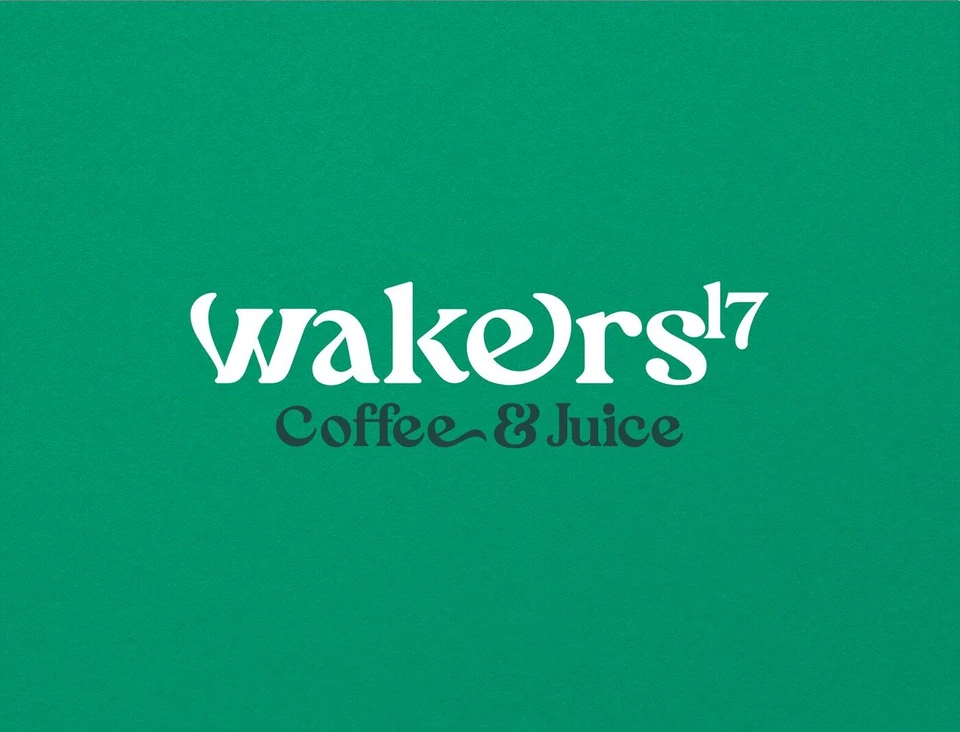
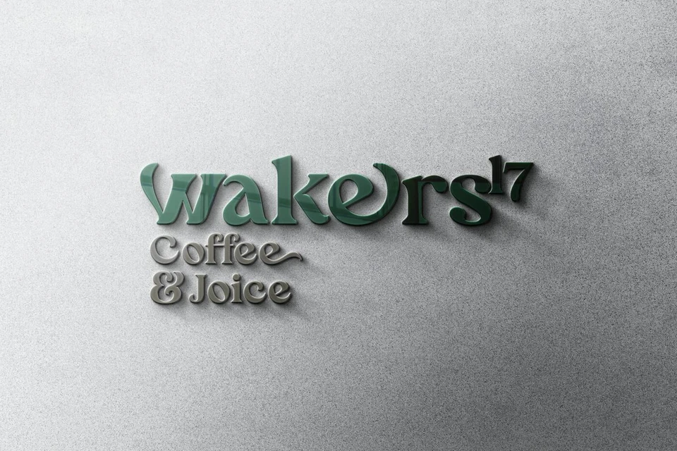
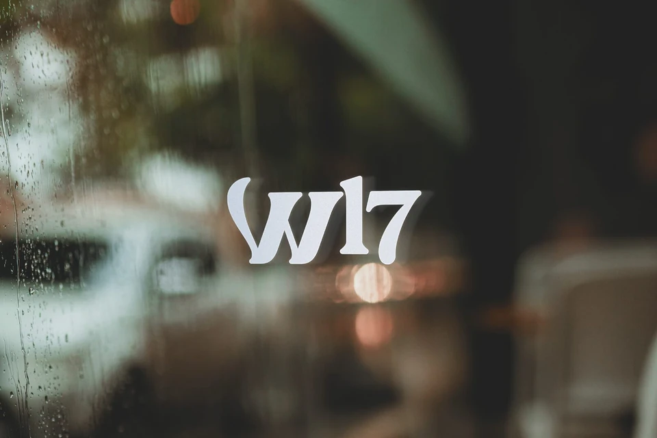
The identity is built from three parts: the Wakers17 logotype, the W17 logomark and the Coffee & Juice descriptor. They lock up in landscape and portrait masters, and the mark works solid or in lines.
Colour
A colours map for the menu.
The prime palette is a navigation system as much as a look: every colour belongs to a part of the menu, from deep green for hot coffee to orange for fresh juice and lilac for sweets. A quieter secondary palette of peach, deep green, charcoal and teal grey holds it together.
- Hot Coffee#48756B
- Fresh Juice#009768
- Iced Coffee#FF9D00
- Cocktails#FFB853
- Fresh Juices#F6542B
- Cookies#EF8062
- Cakes#967DBB
- Sweets#BFACD4
- Peach#F7D2BB
- Deep Green#224541
- Charcoal#353738
- Teal Grey#528189
Typography
Blue Cashews.
A display serif by Aluyeah Studio, with vintage, floral character. Its swashes give Wakers17 its voice, from the logotype to menu names and lines like “Wake up, your coffee is ready!”
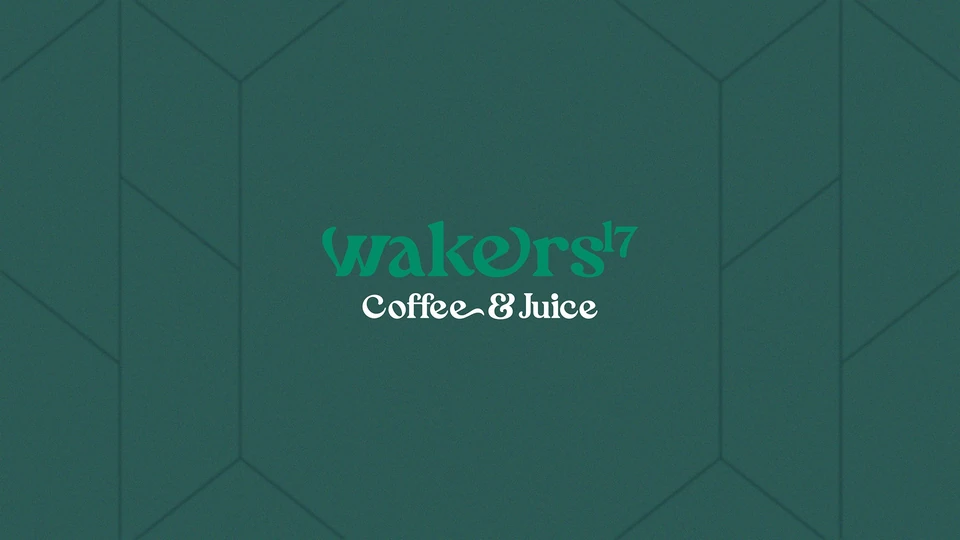
Morning Windows: a geometric pattern of window frames, quiet enough to sit behind the logo and strong enough to carry a surface on its own.
Brand Applications
From the cup to the street.
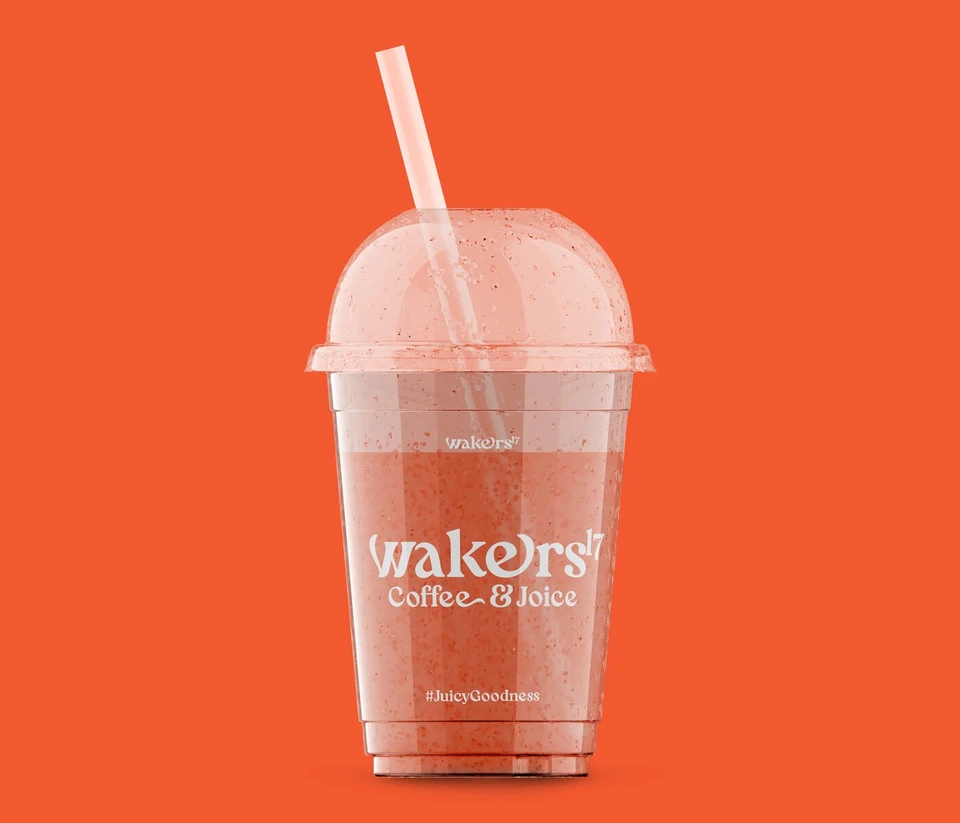
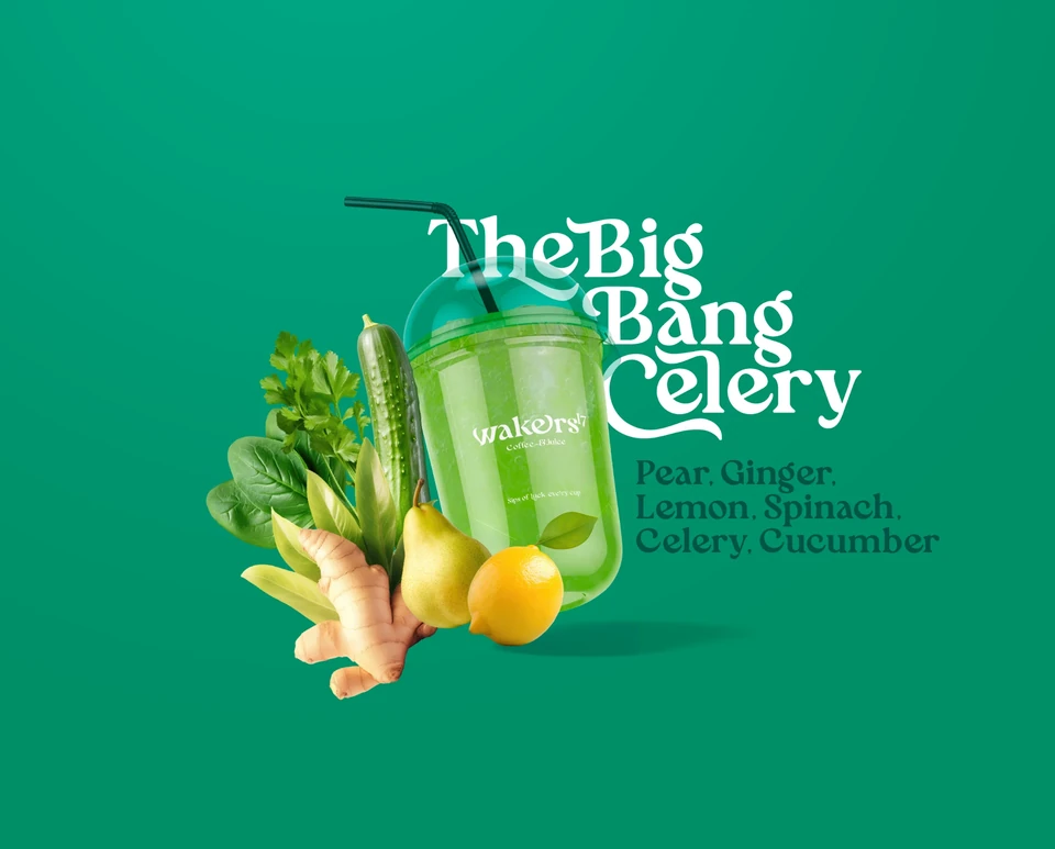
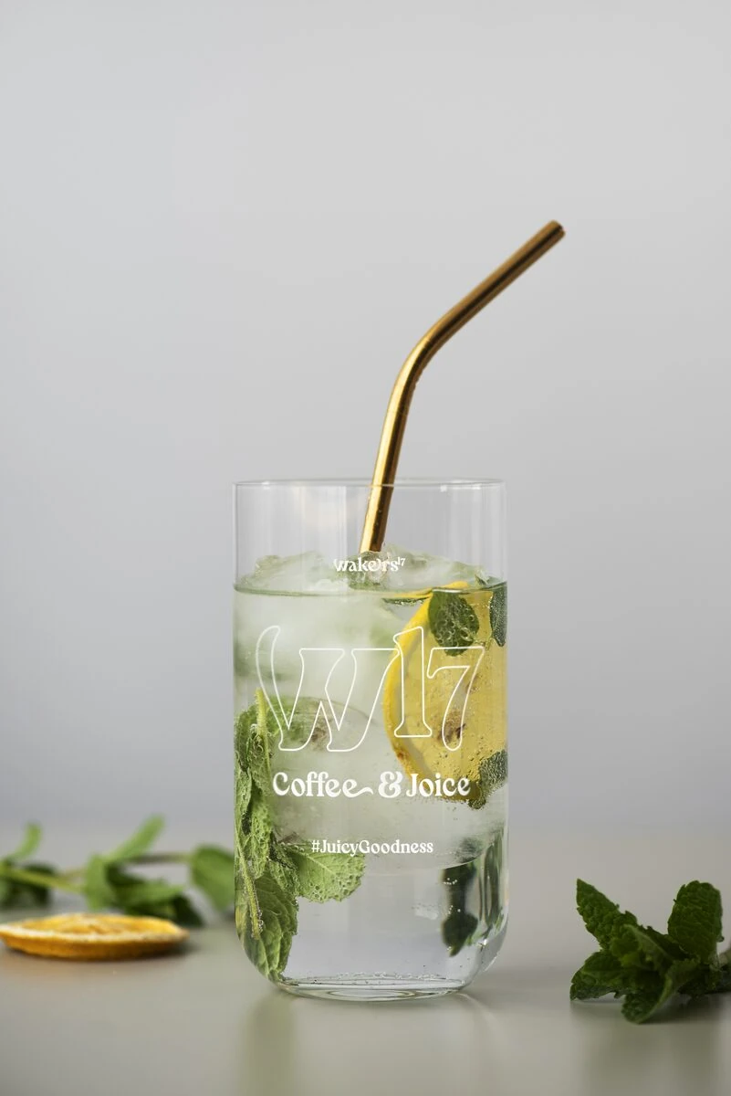
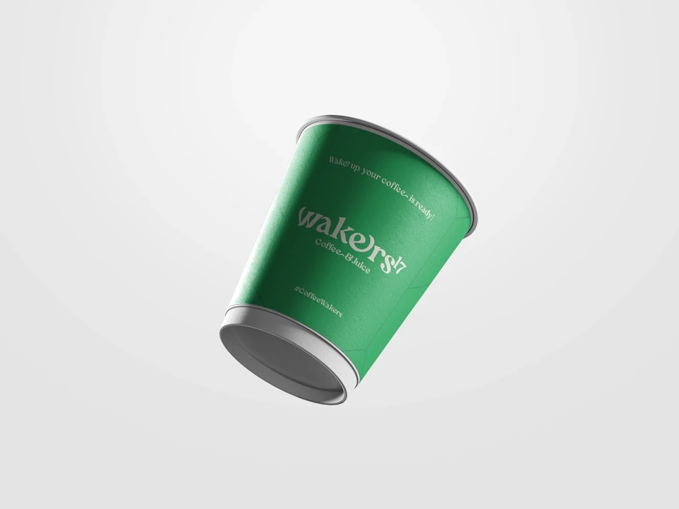
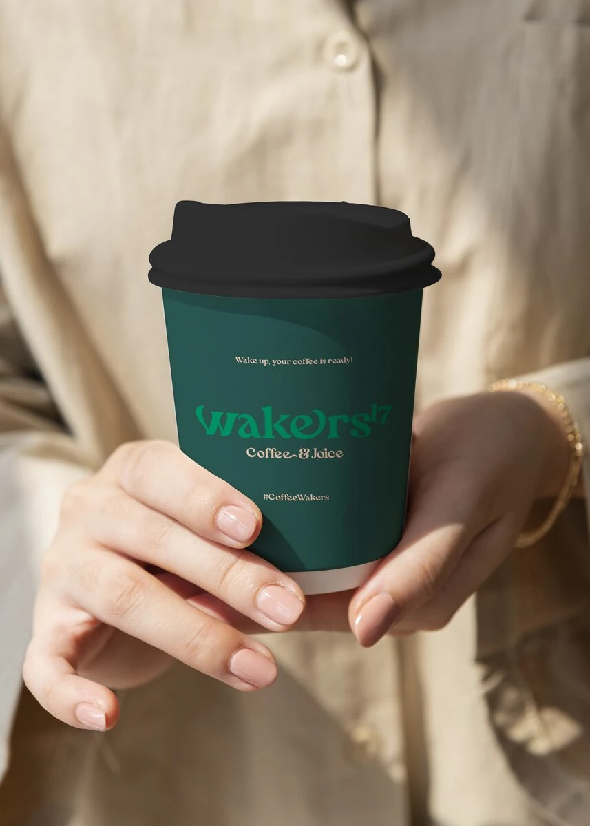
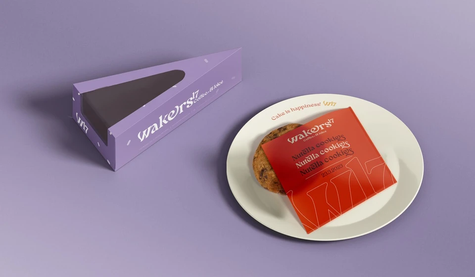
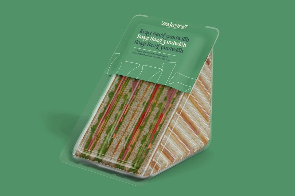
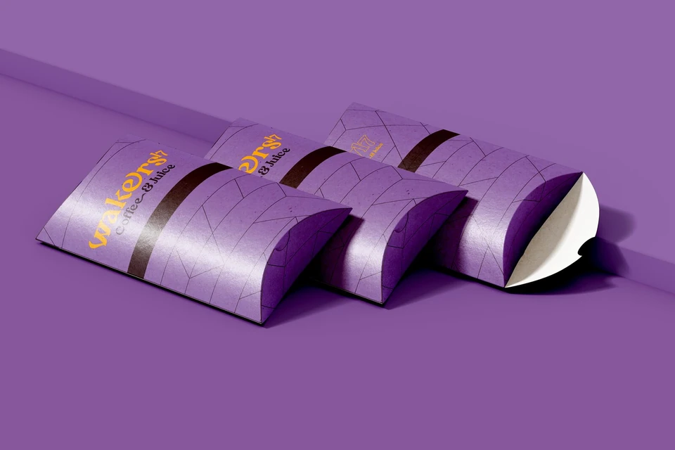
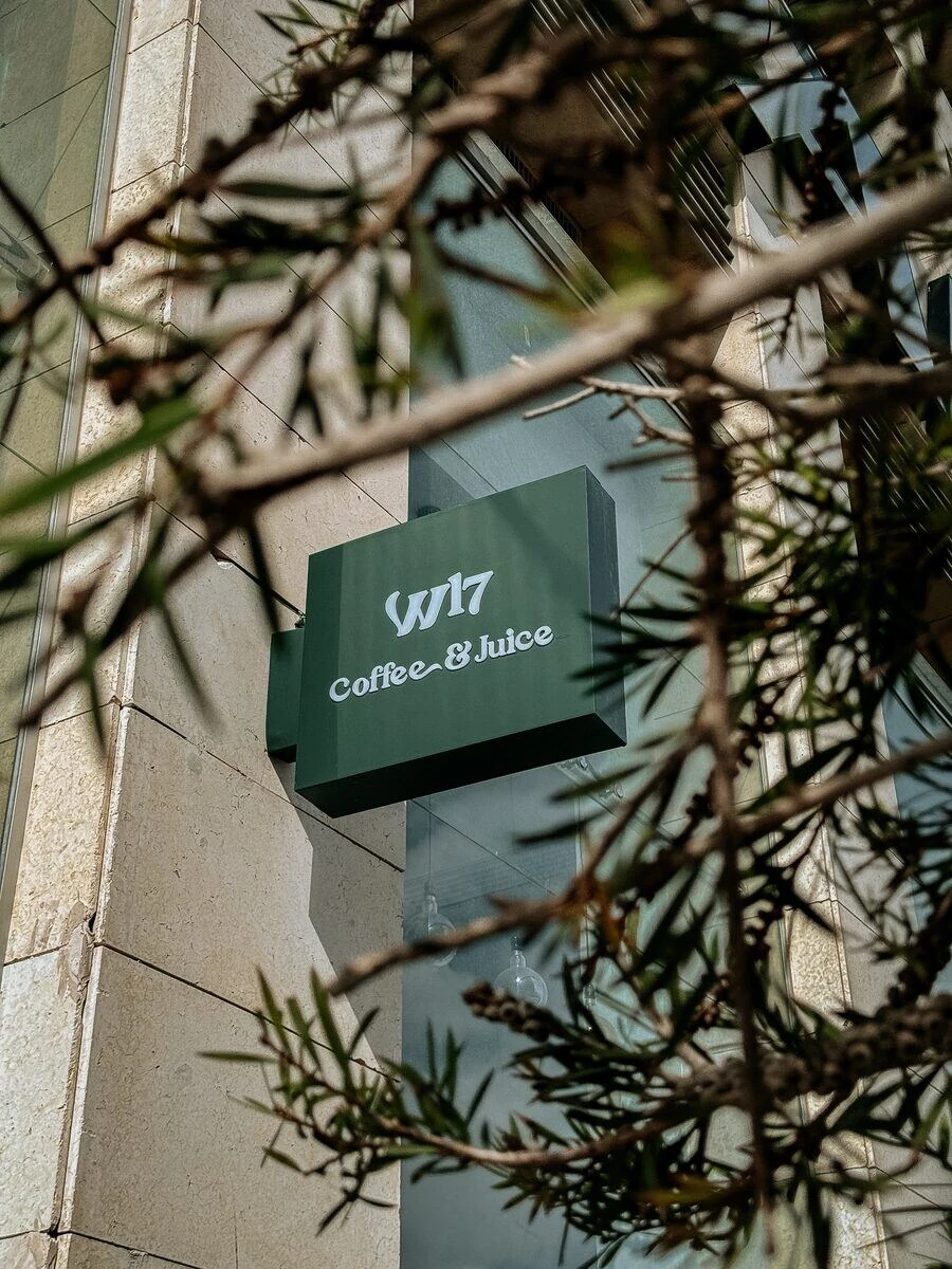
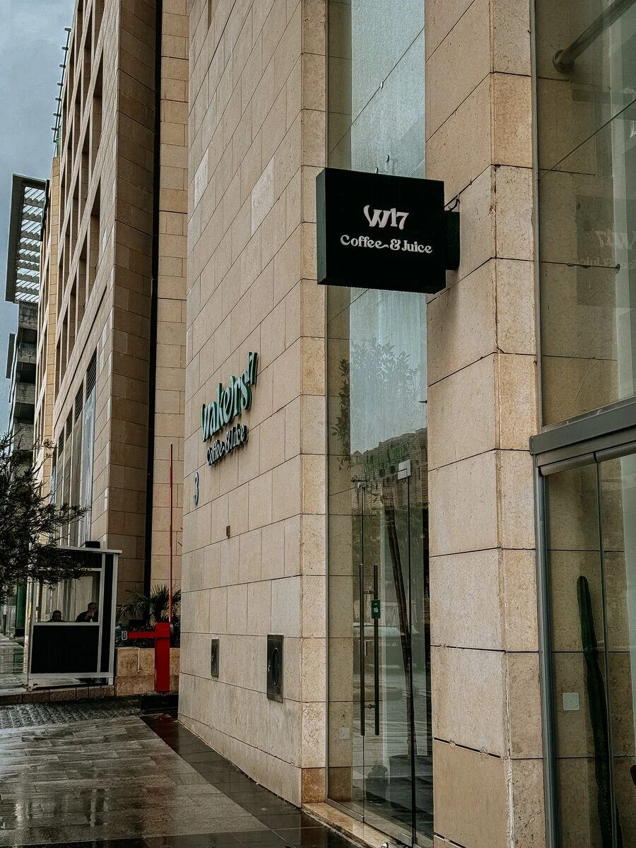
The system comes alive on every touchpoint: cups coloured by the colours map, juice campaigns, takeaway packaging, signage and the shopfront itself.


- Design & Art Direction
- Moh'd Nour Shahen